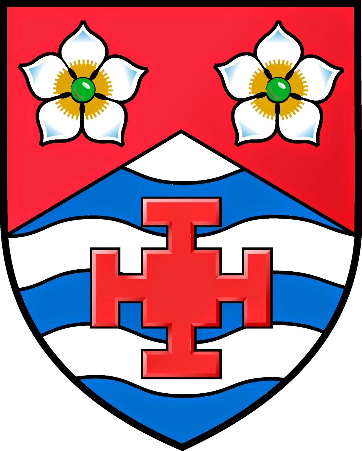
The arms of Chad Michael Krouse, copyright 2014.
Digital artwork by Steve Cowan, July 2014.
After months, and I mean months, of going back and forth over a design for arms, I finally have resolution. With the careful eye of Canadian heraldic artist, Steve Cowan, we designed the above escutcheon to impart something meaningful about me. Steve was a treat to work with, and I highly recommend him. The dogwood flowers, depicted as proper, represent the official flower of the Commonwealth of Virginia--my adopted state. The Cross of Saint Chad is a pun on my name, as Saint Chad is also my patron saint. The three bars, barry wavy, reflect my love of the water (especially fishing). Fishing, my mid-life crisis hobby, was something I wanted to incorporate and had a few designs with fish hooks in saltire. The Blazon
Arms: Per chevron Gules and barry wavy Argent and Azure,in chief two dogwood flowers (cornus florida) proper and in base a cross of Saint Chad of the first;Crest: On a wreath of Gules and Argent, a Cardinal's head (cardinalis cardinalis) erased clutching in its beak a Madonna lilly (lilium candidum) seeded proper;
Motto: Ich Mache Recht.
My arms on a lozenge for my daughter.
Painted by Ceilidh Burdick, Ealeroi Studios, July 2014.
For some reason, it's always harder to create something for yourself as opposed to someone else. Below is a colored pencil drawing of my complete achievement of arms. I mistakenly opted for azure in the wreath and mantling. It is blazoned, now, for gules (red).
Achievement of arms, Chad Michael Krouse.
Colored pencil, by the author. 2014.
Since I had settled on the crest and motto long before the shield, I wanted to make certain that the final design worked in harmony with everything. I believe this was achieved. It is interesting to note that a lot of friends (Facebook) thought it looked off balance. One even went so far as to suggest it looked like a crazy wrestling mask! So it remains a fundamental truth that beauty is in the eye of the beholder. For prior thoughts on the motto and crest, click here.
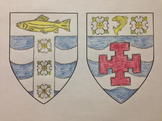
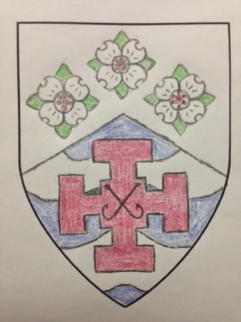
Early drafts in colored pencil.
Here's an example of some of the earlier drafts which struggled to incorporate too much stuff. The medieval canon of heraldry demands a noble simplicity for ease of identification--these miss the mark.
First draft with shield divided "per chevron."
This next image represents the first time I divided the shield "per chevron" but still cluttered up the chief with three dogwoods. Moreover, I made a poor attempt to place a charge upon a charge with no real distinction between the two. This was when I started to see the fish hooks in saltire which do look sharp.
Again, another bad attempt with the chief, but I rather liked the fish hooks in saltire. It was a struggle to decide between the Cross of Saint Chad or the fish hooks. The cross won!
I'm glad that I went through this lengthy process of give and take. It afforded me time to really flesh out what I wanted and how I wanted to be identified vis a vis coat armour. I'm extremely happy with the final design and am ready to proudly display my arms.
_____________________
Epilogue
It's now 2020, and looking back at this post has been touching, to say the least. One critical thing to note, here, is that when the first emblazonment was completed, the wrong dogwood flower was used! Yes, it's wrong! The heraldic artist lives in Canada and had a Canadian version on his mind, which is completely understandable. We made a quick update with the appropriate version for Virginia.


.JPG)


0 comments:
Post a Comment