Recent Posts

Thursday, August 3, 2023

Look to the Seal: An Analysis of Select Works by Pierre de Chaignon la Rose


The arms of Notre Dame of Maryland University as depicted in stained glass from the university's chapel.  Image source:  Notre Dame of Maryland University website.

In my ongoing research on Pierre de Chaignon la Rose (1872-1941), I have learned a great deal about the art and science of heraldry.  Now going on nearly 10 years, I have trained my eyes to look for certain elements in an organizational coat to determine whether or not la Rose designed the arms in question.  Through this method, I discovered one corporate coat of arms that took me down a winding trail, only to discover that the arms were designed not long after la Rose's death by a former student.  

One "dead ringer" is finding a coat of arms within a seal matrix surrounded by the institutional name rendered in Latin, especially if the school was founded in the early part of the 20th Century.  Since many schools that la Rose rendered designs for arms have since closed and their archives scattered or lost, I am incredibly grateful that many of these seals are illustrated with hatch-work for the purpose of blazoning these arms.

Recently, I came across the seal and arms for Notre Dame of Maryland University located in Baltimore, Maryland--immediately alarm bells went off suggesting la Rose may have designed these arms.  Following an email exchange with the university's archives, I had an answer affirming my suspicion. 

Founded in 1873, Notre Dame of Maryland was a college at the time of la Rose's involvement in designing their seal and arms, and represents la Rose's first Roman Catholic academic commission.  La rose designed the arms first in 1914 and then created the seal by 1920 (J. Kinniff, personal communication, August 8, 2023).

Based on my data regarding la Rose's heraldic work for colleges and universities, la Rose's first commission was to provide three draft sketches of arms for the University of Chicago in 1910, followed by his second commission for a seal and arms for Rice University in 1912.  Please click here to read about mistaken identity in the arms for the University of Chicago.

Rice University was, however, la Rose's first academic seal.  His original work for the seal and arms of Rice University can be seen below, and note his signature which "authenticates" it.  If the reader is counting, Notre Dame of Maryland's arms represents la Rose's first Roman Catholic scholastic coat of arms and his third overall for colleges and universities.

In 1910, la Rose received his landmark Roman Catholic commission to design arms for the Archdioceses of Baltimore and Boston, and it most likely that this commission led to la Rose's involvement with Notre Dame of Maryland (La Rose, 1911).  Please click here to read about la Rose's commission in 1910 for the Archdioceses of Baltimore and Boston. 

The arms la Rose designed for Notre Dame of Maryland is blazoned: 

A modern rendering of
the seal and arms
of Notre Dame of Maryland.
Image source: 
Notre Dame of Maryland University
 website.
Quarterly azure and argent, a cross bottony throughout quarterly of the first and second, in dexter canton a rose barbed and seeded of the second.  

Moreover, Notre Dame of Maryland's arms illustrates one of la Rose's methods for suitably differencing a corporate coat of arms.  Please click here to learn more about la Rose's first method for showing unification and differencing in corporate heraldry.  

For Notre Dame of Maryland, la Rose used the cross bottony (from the Lord Baltimore's arms) and the colors white and blue, all found in the archdiocese's coat.  He differenced the quartering on the cross bottony and added a white rose as the symbol for the Blessed Virgin Mary, whereas in the arms for the archdiocese, la Rose used the white star to represent both the Blessed Virgin Mary as well as the state of Maryland.  

La Rose (1911) explains the star used in the arms of the Archdiocese of Baltimore:

"in addition to the cross of Faith, in this its peculiarly Baltimorean form [cross bottony], there remained Our Lady to be more definitely symbolized.  At once the star suggested itself to me, as being not only one of the titles and attributes of Our Lady, but also the accepted symbol of an American state" (5).

The colors white and blue, the cross bottony, the quartering, and the dexter canton charge ties Notre Dame of Maryland to the Archdiocese of Baltimore in a uniquely "la Rosian" style.  In my data, I have numerous examples of how la Rose would continue this method for suitably differencing institutions under the authority of another.

By definition, an organization's corporate seal serves as the signature for authenticating documents.  Within the academy, most encounter the seal on a diploma, attesting the graduate's completion of requirements for the degree earned.  Moreover, seals do not have to be heraldic either, consider the vast sea of seals of the US states.  La Rose sympathizes with the pervasive confusion that exists in most American minds believing a "seal" and a "coat of arms" to be synonymous (La Rose, 1917, 190).  

La Rose (1917) gives an example of why an organization would want to bear arms while demurring the current state of corporate heraldry at that time:

"A seminary is to be built, let us say, in traditional 'collegiate gothic.'  Above the portal the architect wishes to place several well cut shields...finally the architect clamors for the heraldry of the seminary itself.  
"'Oh yes,' muses the Rector, 'we have a seal,' and produces a stamp...[read a non-heraldic seal]" (191). 

La Rose continues in the article to describe the plight of the poor architect who now has to devise arms for the fictional seminary in order to complete the interior decoration of the building.  Through this example, we in fact learn how la Rose likely got his start as a herald.  The majority of la Rose's earlier commissions came by way of his friend Ralph Adams Cram (1863-1942), the noted American architect and father of "collegiate gothic."  One limitation in my data is that I cannot explain why la Rose used gothic tracery in his seal for Notre Dame of Maryland, as no gothic buildings exist on campus. 

With an increasing interest from institutions to adopt coats of arms, La Rose (1917) adds:  

"In short, it is often useful, as well as very pleasant, to have a corporate coat-of-arms for a religious institution irrespective of whether or not it is to be used on the institution's seal.  In the first place, it is a valuable architectural decoration...where a seal would be wholly out of place.  

"And it is largely for this reason that many corporate bodies are reverting to the ancient use of corporate heraldry, not from any snobbish, 'aristocratic' impulse--for corporate heraldry as such never had any 'aristocratic' implications whatever, but from a natural desire to avail themselves of a traditional decorative means of adding to the beauty, dignity, and significance of their environment" (192).

Beauty, dignity, and significance are three extremely great reasons for a corporate body to possess arms.  Many schools and universities employ their seals on souvenirs as a decoration, even when seemingly inappropriate.  

An example of a non-heraldic corporate
seal set within a vesica piscis, that of
Sewanee: The University of the South.
Note the descending dove.
Image source:
The University of the South website.
In 1956, Richard Bland Mitchell (1887-1961), the Episcopal Bishop of Arkansas, pressured Sewanee: The University of the South to stop using the legal corporate seal to, "validate souvenir china" (McCrady, 1982, page 29).  The bishop was successful in rallying the university's governing board to his cause and stated that the board, "objected to the Holy Ghost descending into beer mugs" (McCrady, 1982, page 29).  

Sewanee's corporate and non-heraldic seal contains a descending dove representing the Holy Ghost.  Undoubtedly, Dr. James Warring McCrady (b.1938) used the bishop's argument to devise arms for the university in 1981.  Please click here to learn about Dr. McCrady's designs for the heraldry of The University of the South.  It's funny to read the bishop's objection now in 2023, but a great reason for institutions to use heraldry as a decoration rather than the legal corporate seal.

Below is a snippet of seals designed by la Rose in chronological order.  I have endeavored to find as close as possible la Rose's submitted design work, as opposed to any modern digital creations.  Again, notice the heraldic hatching which helps guide the blazoning of arms.  

Based on my experience so far, a lot of these institutions have either lost, modernized their arms for marketing purposes, or simply do not have a blazon in their archives.  Alas, heraldic hatching saves students of heraldry the headache of attempting to interpret the coat as the designer intended.  


The seal of Rice University in Houston, TX designed in 1912.  After his sketches for the University of Chicago in 1910, Rice was la Rose's second academic coat, but his first academic seal.

Azure, two chevronels argent between as many Athenian Owls of the second


The seal of St. Mary's Seminary and University (Roman Catholic) in Baltimore, MD designed in 1917 (La Rose, 1918). Note how la Rose went with a new scheme for displaying the cross bottony.

Per bend or and sable, on a bend argent three crosses bottonny of the second; on a chief azure, between two stars of six points argent, the Badge of the Society of Saint Sulpice in the United States


The seal of St. John's Seminary (Roman Catholic) in Boston, MA designed in 1917 (La Rose, 1918).  The "aureoled" eagle is a symbol for St. John.  The trimount in base is la Rose's way of canting Boston.  La Rose (1911) offers this: "Boston at one time having been called, in early Chancery documents, Tremontinensis" (5).  The trimount can found in countless Boston-area arms devised by la Rose.

Gules, an eagle displayed argent, aureoled or, above a trimount of the last


The seal of Boston College in Boston, MA designed in 1917 (La Rose, 1918).  Boston College's arms are the only coat la Rose employed Greek for the text on the open book.  There are a few examples of Greek letters, such as "alpha" and "omega" that he used for other coats.

Gules, above a trimount in base or, an open book argent edged of the second, thereon an inscription (in Greek, "ever to excel"); on a chief sable between two crowns composed of alternate crosses patty and fleurs-de-lis or, the badge of the Society of Jesus


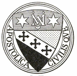
The seal of Notre Dame of Maryland University designed in 1920.  According to Dougherty (1949), the seal of the college, "was adapted in 1920" (page 18) and this date has been confirmed by the university (J. Kinniff, personal communication, August 8, 2023). La Rose's first Roman Catholic academic institutional coat and his third scholastic coat designed.  This image of the seal is from Dougherty's (1949) master's thesis.

Quarterly azure and argent, a cross bottonnee throughout quarterly of the first and second, in dexter canton a rose barbed and seeded of the second


The seal of St. Benedict's College in Atchinson, KS designed in the 1920s.  I am waiting on confirmation from the institution.  The cross moline is a heraldic symbol for St. Benedict.  

Argent, a cross moline sable, on a chief embattled azure an open book with two clasps or thereupon inscribed VIA VERITAS VITA ("the way, truth, and life")


An example of how la Rose differenced the arms of St. Benedict's College from those of St. Benedict's Abbey, both in Atchinson, KS.  For the abbey, la Rose used a white crescent, and for the college an inscribed open book.  The abbey founded both the college and St. Scholastica.  I am waiting on confirmation from the institution.  Dom Wilfried Bayne, OSB (1893-1974), a student of la Rose and respected herald in his own right, offered this blazon: 

Argent, a cross moline sable, on a chief embattled azure a crescent argent


The seal of the College of St. Scholastica (now St. Benedict's College) in Atchinson, KS designed in the 1920s.  This was the sister school to St. Benedict's.  I am waiting on confirmation from the institution.  

In Kerr (1956), we find a transcription from one of la Rose's letters to the school detailing the design rationale for the arms:
"So I propose: A red shield, thereon a gold lion holding a book in profile (for the college) with a silver dove resting for a moment on the top edge of the book. The dove, of course, represents the spirit of Saint Scholastics, as Saint Benedict saw it ascending, at her death. This, I think, will make as choice a bit of heraldic symbolism as that very restricted art permits, and I think I can make a handsome shield of it" (29).
Gules a lion rampant supporting a closed book with three clasps all or perched thereon a dove argent 

The seal of The Lenox School in Lenox, MA (now closed) designed between 1925-1930.

Sable, on a cross saltire or an open book edged of the second and inscribed NON MINISTRARI SED MINISTRARE ("not to be ministered unto but to minister"), between as many roses barbed and seeded with a martin in chief all or  


The seal of the College of St. Rose in Albany, NY designed in the 1920s.  Albany was la Rose's hometown.  La Rose varied the shield's shape, and he placed the roses in semme, a design technique he rarely used with corporate coats.  This image of the seal is from Dougherty's (1949) master's thesis.

Argent, a semme of roses barbed and seeded gules, on a chief azure three lilies of the first

The seal of St. Thomas Seminary (Roman Catholic) in Hartford, CT designed between 1930-1934.  The colors gold and red represent St. Thomas Aquinas.  Is the lion argent or proper?  I say argent, based on similar techniques la Rose used.     

 Bendy or and gules a lion rampant argent  


The seal of St. Joseph's College in Rensselaer, IN designed in 1934.  La Rose rarely used bordures in his heraldry, and note the use of "gutty de sanguine" to honor the Fathers of the Precious Blood which opened the school.  Very little information on these arms.  This is my educated guess at this point.

Azure within a bordure argent eight gutty de sanguine a chevron between as many lillies seeded of the second


The seal of Trinity Washington College, now Trinity Washington University in Washington, DC designed in 1935.  According to Doughtery (1949),"upon the triangle is placed an open book, gold-edged and bound in gold, bearing the motto of the College" (15).  For a further analysis on the arms of Trinity Washington College, please click here.

Gules, on a triangle inverted and void of the field an open book with three clasps all or inscribed SCIENTA ANCILLA FIDEI ("knowledge the handmaid of faith"), on a chief azure three stars argent


Works Cited

Dougherty, Margaret (1949).  A Study of the significance of the Symbols and other items comprising the coat of arms and seals of girls Catholic colleges in the north and middle Atlantic states [Master's thesis, Canisius College].  ProQuest Dissertations Publishing.

La Rose, Pierre de C. (1911).  The arms of His Eminence Cardinal Gibbons. In H.J. Heuser (Ed.), The Ecclesiastical Review, 45(July), pp. 2-5.

La Rose, Pierre de C. (1918).  Some examples of corporate Catholic heraldry.  In H.J. Heuser (Ed.),  The Ecclesiastical Review, 55(Feburary), pp. 189-198.

Kerr, Mare E. (1956).  A study of the significance of the symbols and other items comprising the coat of arms and seals of girls Catholic colleges in the north central states of the United States [Master's thesis, Canisius College].  ProQuest Dissertations Publishing. 

McCrady, J. (1983).  After 125 years completing the university's heraldry. The Sewanee News, vol 49(1), 30.

Friday, April 28, 2023

Looking back at old designs


Proposed arms for an Episcopal parish in Maryland. 
The parish, named in honor of St. Andrew, still uses the old warden's wands placed in saltire with the cross bottony from Maryland surrounding them.  Never adopted, designed in 2014.

Sometimes it's fun to go back through the old files and take a look at my old designs.  Many of these designs which I've posted here were never adopted.  Nonetheless, I had fun putting them together.  Enjoy.

Literally just had fun adding the priest's gallero. Never adopted.  Designed in 2014.


Draft of personal arms, never adopted.  Designed in 2020.


Proposed arms for a university's school of business in Tennessee. 
Never adopted. Designed in 2020.


Draft of a number of designs for personal arms, never adopted.
Designed in 2014.


Proposed arms for a gentlemen's hunting & fishing club,
never adopted.  The crew were primarily Hampden-Sydney men (hence the pheon) and did a ton of trout fishing.  I loved this one. Designed in 2020.


Crest for new arminger, and it was adopted!  Shield is below.
Designed in 2014.


Arms adopted by the new arminger, designed in 2014.  His crest is above.


Tuesday, July 21, 2020

Variations on a Theme: Pierre de Chaignon La Rose and the Cross in National Colors

The arms of Cardinal Gibbons (1834-1921) as painted and devised by la Rose for Gibbons' elevation as the Cardinal Archbishop of Baltimore in 1910, and appearing in La Rose (1911).

Among the many coats designed by Pierre de Chaignon La Rose (1872-1941), there stands out one unique device, or ordinary, that he used in multiple ways for both American Episcopal and Roman Catholic institutions.  The cross in "national colors" was among his most used ordinaries in devising coats of arms for these institutions.  For some background on La Rose, please see my previous post here.  In this post, I will explore in chronological order this theme of the cross in "national colors" as the main ordinary in several of his designs.  I've cited my sources at the end of the article as several of these coats will be new to many enthusiasts of heraldry.  I also wish to thank Joe McMillan of the American Heraldry Society and NEHGS Committee on Heraldry for his editorial review of this article.

Berkeley Divinity School (1906)

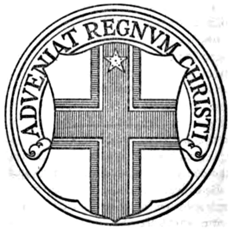
The earliest such example of the cross in national colors comes from the arms of Berkeley Divinity School at Yale which la Rose designed in 1906.  Berkeley is an seminary of the Episcopal Church attached to Yale Divinity School.  For La Rose's commission, Berkeley was not yet affiliated with Yale.  Berkeley would officially join the Yale Divinity School in 1971. 

The arms of the Berkeley Divinity School at Yale devised by la Rose in 1906.
Image source: Berkeley Divinity School website.


According the The Living Church (1906), la Rose reworked an existing coat that had been in use by the school but needed to conform the design to heraldic norms.  

Coat of arms of Berkeley Divinity School at Yale
Arms of the Berkeley Divinity School at Yale.
Rendered by Chad Krouse, 2024.
The arms of the Berkeley Divinity School at Yale are blazoned: "azure, a cross gules fimbriated argent, in dexter chief a star of eight points of the last.  Crest: that of the Berkeleys which is a mitre gules bordered and stringed or, bearing a chevron between ten crosses pattees, six in chief and four in base, all argent."  

Furthermore, the article notes that the motto adopted by the school is, "the Vulgate version of II Corinthians 10:16, In illa quae ultra sunt (to the regions beyond)."  A fitting motto for a seminary.

Archdiocese of Baltimore (1910)

Coat of arms, the Archdiocese of Baltimore.
Rendered by Chad Krouse, 2024.
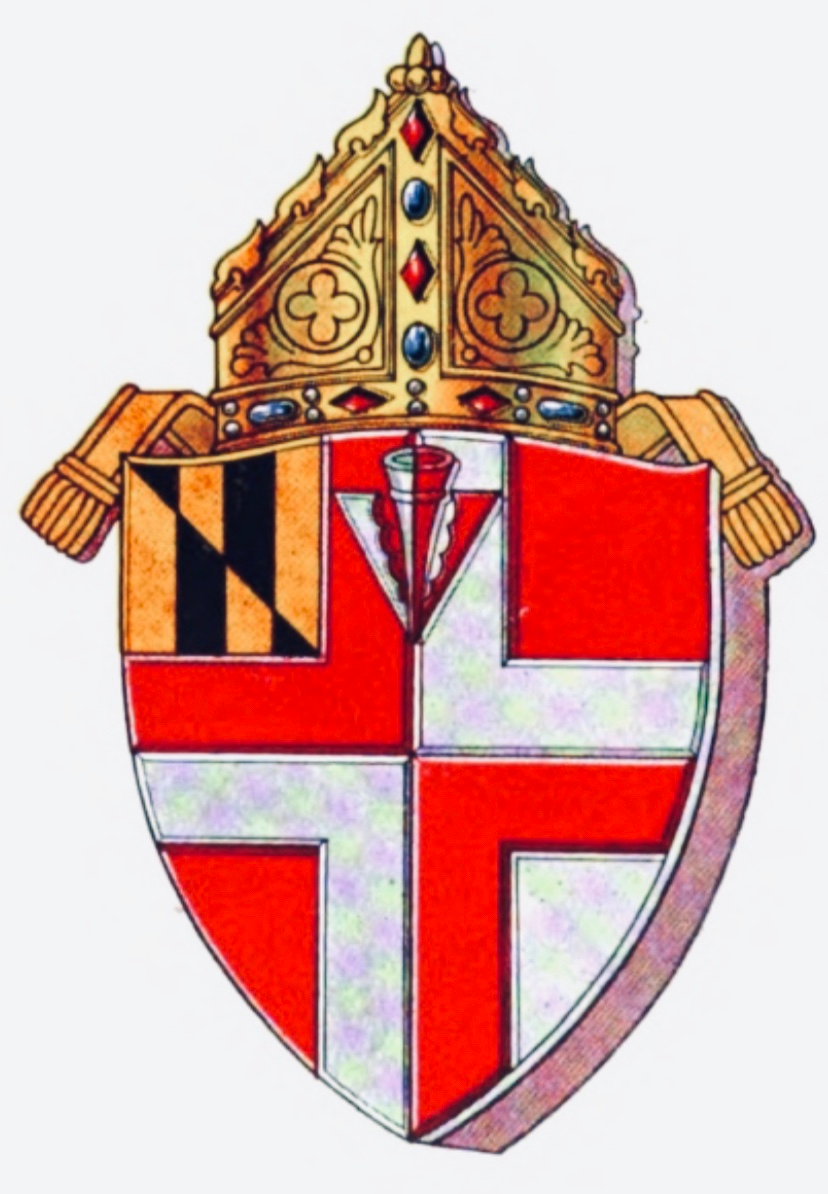
By 1910, la Rose landed perhaps one of the most important heraldic commissions of his young career when James Cardinal Gibbons was elevated to America's premier see of Baltimore (see image above).  
According to La Rose (1911), the blazon for the Archdiocese of Baltimore is, "quarterly azure and argent, a cross bottonnée throughout quarterly of the second and gules, in dexter chief a star also of the second" (pg. 4).  This coat is the first known Roman Catholic coat that La Rose devised.  It's highly likely that Gibbons knew of la Rose as a leader in the field due to his portfolio of Episcopal diocesan heraldry.  Additionally, La Rose (1911) illustrates the new arms for then Archbishop of Boston and future Cardinal, William Henry O'Connell (1859-1944).       

Archdiocese of Baltimore flag coat of arms crest shield
Banner of arms for Archdiocese of Baltimore.
Rendered by Chad Krouse, 2024. 
There seems little doubt that the commissions from Gibbons and O'Connell effectively launched la Rose's career within the growing Roman Catholic Church in America, for a virtual explosion of requests for Roman Catholic diocesan coats would ensue.  

Episcopal Diocese of Maryland (1916)

The arms of the Diocese of Maryland as painted by la Rose. 
Image Source: Diocesan Convention of Maryland (1916).
Not long after la Rose's commission for the Archdiocese of Baltimore, he devised arms for the Episcopal Diocese of Maryland, headquartered in Baltimore, and it's new cathedral.  Again, la Rose used the cross as the main ordinary of the field.  While not distinctly a "cross in the national colors," I thought it important to show the evolution of his thought process.  

The Cathedral League of Women consulted the architect of the new Cathedral of the Incarnation, Bertram Goodhue, who referred the group to la Rose (Diocesan Convention of Maryland, 1916, pg. 24).  Note that Goodhue was a partner with Ralph Adams Cram (1863-1942) of Boston, la Rose's main partner in crime for receiving heraldic referrals from many Episcopalian organizations.  
During the diocesan convention held in November of 1916, the convention officially adopted la Rose's design, which DeKay (1993) gives as, "quartered argent and gules, a cross counterchanged, bearing a pheon in the chief; quarter 1, paly of six, or and sable, counterchanged bendwise for Maryland" (pg.42).  La Rose completed another important commission in Baltimore for the Episcopal Diocese that same year with the arms of it's new cathedral.

Cathedral of the Incarnation (1916)

The seal of the Episcopal Cathedral of the Incarnation, Baltimore, MD. 
Designed by la Rose in 1916. Image Source: DeKay (1993).
Earlier in May of 1916, the Cathedral League of Women presented their first gift of heraldry to the Diocese of Maryland, a seal for the new Cathedral of the Incarnation (The Living Church, 1916, pg. 150).  DeKay (1993) gives the blazon as, "quarterly argent and gules, a cross counterchanged with a pheon of the second in the first quarter" (pg. 106).  

Arms of the Cathedral of the Incarnation.
Rendered by Chad Krouse, 2024.

Episcopal Missionary District 
of the Philippine Islands (1913-1916)

The seal of the Missionary District of the Philippine Islands.  Image is from DeKay (1993).
Addition as of 8-15-23:  As my research on la Rose progresses, I have found another coat of arms within the theme of the "cross in national colors," used by the Missionary District of the Philippine Islands of the Episcopal Church.  The district was formed in 1901 and its status changed in 1937--dates that fit within la Rose's lifetime.  With limited access to the district's complete series of journals online, I have pieced together some information to inform my attribution to la Rose.   

According to the missionary district's annual reports that are accessible, the years being 1909, 1910, 1911, 1912, and 1913, there is no use of the seal or mention of its adoption.  However, a very interesting fact surfaced in my review of these documents.  

Arms of the Missionary District of the Philippine Islands.
Rendered by Chad Krouse, 2024.
In Missionary District of the Philippine Islands (1913), noted Boston architect Richard Clipston Sturgis (1860-1951) is mentioned twice for preparing architectural designs for St. Luke's in Manila (page 11 and 36).  La Rose and Sturgis worked together in 1910 when la Rose designed the arms for the Brookline Public Library in Brookline, MA.  Please click here to read my analysis of the arms of Brookline Public Library.  It is likely that if Sturgis needed a coat of arms for his architectural rendering for St. Luke's, la Rose would have been enlisted.

Datewise, we can presume these arms were likely designed after 1913 and very probably around 1916 given la Rose's unique design for the Diocese of Maryland and it's cathedral as noted above.  Other than The Rev. John A. Nainfa, S.S. (1878-1938), no one else in the US was designing arms using the quarterly-counterchanged cross. 

A colored rendering of the seal of the Missionary
District of the Philippine Islands,
image is from Wikipedia.  
Moreover, the cathedral for the missionary district is named the Cathedral of St. Mary and St. John and located in Manila.  The silver/white star in the coat is very likely a reference to either the Philippine's status vis a vis the US or the Blessed Virgin Mary, a method of la Rose to employ a charge or colors to reference the patron saint of the see's cathedral or its dedication.  In my data of now over 200 corporate coats, I have 19 diocesan coats designed by la Rose where he uses a charge or certain tinctures as a reference to the patron saint of the see's cathedral.

Finally, the mitre used within the vesica piscis is unique to la Rose.  In a letter from September 3, 1912 to The Rt. Rev. David Hummell Greer (1844-1919), Episcopal Bishop of New York, la Rose provides sketches for possible arms for the Diocese of New York to consider.  As he closes the letter to the bishop, la Rose addresses the mitre he prefers to use as the external ornament placed above the shield:
"The mitre on my drawing [proposed coat of arms for the Episcopal Diocese of New York] is copied with very slight modification from those on the roll of peers dated 1515 in the Herald's College [College of Arms, London], a type which has crystallised and become now practically their official heraldic form for a mitre, and here we are concerned only with the mitre from the point of view of heraldry, not of archeology or liturgies" (Letter from Pierre de Chaignon la Rose to the Right Reverend David H. Greer).
Having seen la Rose's painting for New York, it is the exact same mitre used for the Diocese as Maryland as can be seen above.  La Rose would adorn countless diocesan coats with this exact mitre.  Data does not lie!  Thus, I proudly give la Rose credit for the arms of Missionary District of the Philippine Islands.  DeKay (1993) gives the blazon as, "quarterly gules and argent, a cross counterchanged, in dexter chief a mullet of the second" (pg. 87).


Catholic Church Extension Society (1918)

Coat of arms of the Catholic Church Extension Society
Arms of the Catholic Church Extension Society.
Rendered by Chad Krouse, 2024.
Two years later, La Rose (1918) illustrates the newly devised arms for the Catholic Church Extension Society and provides the blazon as, "argent, a cross gules cottised azure, charged in chief with a star or" (pg. 192).  

The arms of the Catholic Church Extension Society devised by La Rose in 1918, and appearing in La Rose (1918).
La Rose further notes that, "the Right Reverend President of the Society, Monsignor Kelley, desired the arms to express, in the abstract conventions of heraldry, simply the Catholic Faith, the United States, and Our Lady's patronage.  That this is done by means of the Cross in the national colors and the star of Our Lady should be clear to readers" (pg. 192-193).  

Additionally, La Rose (1918) illustrates the newly devised arms of the Catholic Foreign Mission Society of America, a.k.a. the Maryknolls, and notes that these arms were designed by his Sulpician friend, The Rev. John A. Nainfa, S.S.  

The coat of arms of the Catholic Foreign Mission Society,
designed by The Rev. John A. Nainfa, S.S.
Rendered by Chad Krouse, 2024.
The blazon la Rose offers is, "argent, a cross quarterly azure and gules" (pg. 193).  La Rose goes on to state, "here the same idea--the Cross in the national colors--is carried out with admirable directness and decorative simplicity" (pg. 193).  Ever the humble designer, la Rose continues, "another version [of the cross in national colors] still may be seen on the arms of the See of Baltimore as impaled on the coat of His Eminence, Cardinal Gibbons" (pg. 193).  A clear reference that la Rose was the first to express this design heraldically.     

National Student Council 
of the Episcopal Church (1919)

Coat of arms of the National Student Council of the Episcopal Church
Arms of the National Student Council of the Episcopal Church.
Rendered by Chad Krouse, 2024.
Addition as of 10-3-23:  In 1919, la Rose cleverly devised arms for the National Student Council of the Episcopal Church using a cross in national colors--his first such design for a national Episcopal-affiliated organization. (National Student Council of the Episcopal Church, 1920 March, 12).  

The arms of the National Student Council
of the Episcopal Church
appearing in Morehouse (1941), page 27.
According to Turner (2010), the National Student Council was formally organized in May 1918 by the Conference of Episcopal College Workers to function as an advisory council of students to the Presiding Bishop (32).  In 1935, the Church Society for College Work, also an Episcopal-affiliate, would be established separately from the student council and organized to assist college ministry in a variety of ways including fundraising (Turner, 2010, 34).  Both groups, it would appear, used the same coat of arms.

While the above image is hard to image in full color, I believe la Rose pulled together several elements into this design to clearly identify the owner as a quasi-academic institution within the Episcopal Church.  At this point, remember, the Episcopal Church did not have any national symbols and thus the bordure with the bishop's mitres was the best option.  The inscribed and open book identifies the academy and employs a fitting motto, "for Christ and the Church."

The blazon for the arms of the National Student Council of the Episcopal Church/Church Society for College Work is: argent a cross gules cotised azure, over all an open book with two clasps or thereon inscribed PRO CHRISTO PER ECCLESIAM and on a bordure azure eight bishop's mitres argent.  

Foreign Mission Sisters of St. Dominic (1923)

A beautiful full color emblazonment of the arms of the Foreign Mission Sisters of Saint Dominic from Conning (2023 September 13).  Image courtesy of the Maryknoll Mission Archives, September 2023.

By 1923, we see more examples from the Maryknolls, devised by both Nainfa and la Rose.  The Field Afar, the official organ of the Catholic Foreign Mission Society of America, published two coats of arms in their September edition--the previously shown arms of the Catholic Foreign Mission Society of America (which la Rose credits Nainfa for the design in the Ecclesiastical Review) and the new arms of the Foreign Mission Sisters of Saint Dominic (now simply, the Maryknoll Sisters of Saint Dominic). 

The Maryknoll Mission Archives posted an article on September 13, 2023 regarding these arms and included full colored emblazonments.  Please click here to read the Maryknoll Mission Archives article.

As a result of their post, I wanted to dig a little deeper in the story surrounding these two distinctive arms.

The coat of arms of the Foreign Mission Sisters of St. Dominic.
Rendered by Chad Krouse, 2024.
The arms of the Foreign Mission Sisters of Saint Dominic carry the gyronny of eight representing the order's ties to Saint Dominic as well as the new Maryknoll cross of national colors.  The blazon is:  gyronny of eight argent and sable, a cross quarterly azure and gules. 

Article from The Field Afar, September 1923, page 254.  Click image to enlarge.

Catholic Students' Mission Crusade (1924)

Catholic Students' Mission Crusade coat of arms
Arms of the Catholic Students' Mission Crusade.
Rendered by Chad Krouse, 2024
.
The Catholic Students' Mission Crusade (CSMC), founded in 1918, would grow to become one of the most successful youth movements of the 20th Century for evangelism.  The CSMC became a dynamic force within the church and modeled itself on the imagery of the crusades in order to help inspire young women and men to help conquer the world for Christ (Endres, 2007).  And what respectable crusader would go without bearing arms?  Enter Pierre de Chaignon la Rose.

The banner of arms of the Catholic Students' Mission Crusade designed by la Rose in 1923. 
Source: United States Patent Office (1924).


The Catholic Students' Mission Crusade
Paladin Leader Award.
Source: Author's private collection.
While the CSMC used a rather unattractive coat of arms by 1923, the banner designed by la Rose would play a role in the right of initiation (Endres, 2007).  As such, la Rose was contacted to devise a banner of arms for the CSMC.  At some point, likely in the 1930's, the older version of the arms were dropped in favor of la Rose's design, albeit with the inscription cognoscetis veritatem, or "know the truth," from John 8:32 added to the open book.  These new arms would be used for the neck jewels of the order. 

The arms of the Catholic Students' Mission Crusade are blazoned: quarterly argent and azure, a cross quarterly gules and the first, thereupon an open book or inscribed Cognoscetis Veritatem (Know the truth, John 8:32).  The patent for the banner of arms was filed on December 31, 1923.  

Catholic University of America (1933)

The Catholic University of America coat of arms
The arms of The Catholic University of America.
Rendered by Chad Krouse, 2024.
Perhaps one of la Rose's most well-known arms appeared in 1933, a truly national design for the Catholic University of America located in Washington, DC.  La Rose literally reversed his design scheme of the Catholic Students' Mission Crusade, added a crescent in the first quarter, and a different inscription upon the open book.  And voila!  The arms of Catholic University.

The arms of the Catholic University of America are blazoned: quarterly azure and argent, a cross quarterly of the second and gules charged with an open book or thereupon inscribed Deus Lux Mea Est (God is my light), in the first quarter a crescent of the second.  It's a lovely design.
Banner of arms for the Catholic University of America.
Rendered by Chad Krouse, 2024. 

Gallery of Living Catholic Authors (1937)

Another example of the cross in national colors comes by way of the arms of Gallery of Living Catholic Authors.  Founded in 1933 and led by Sister Mary Joseph, S.L., Ph.D., the purpose of the gallery was threefold:  providing a Catholic literary hall of fame, creating awareness of contemporary Catholic literature, and to be a repository of letters, photographs, manuscripts, and books all for future research and scholarship (Joseph, 1945, pg.75).  The Gallery used Cram for its building design and that's likely how la Rose got involved with designing their coat.

The arms of the Gallery of Living Catholic Authors designed by la Rose in 1937.
Rendered by Chad Krouse, 2024.
La Rose designed these arms in 1937, and this coat is hands down my all-time favorite design of his (La Rose, 1937).  The blazon for the arms of the Gallery of Living Catholic Authors is: quarterly gules and argent, a cross throughout quarterly argent and gules, in saltire two feather quills counterchanged over all an open book edged with three clasps or thereon inscribed In Principio Erat Verbum (In the beginning was the word, John 1:1).  

Confraternity of Christian Doctrine (1938)

Confraternity of Christian Doctrine coat of arms
The arms of the Confraternity of Christian Doctrine designed by la Rose in 1938.
Rendered by Chad Krouse, 2024.
Towards the end of la Rose's life, he used the cross in national colors for another national Catholic organization, the Confraternity of Christian Doctrine which adopted the following arms in 1938: argent, a cross quarterly quartered gules and azure void of the field thereupon an open book with three clasps or inscribed Deus Est (God is).  

These arms fascinate me.  Just when you thought la Rose may have exhausted a cross of national colors, we get these arms.  

The Episcopal Church (1938-1939)

Coat of arms of the Episcopal Church
Arms of the Episcopal Church.
Rendered by Chad Krouse, 2024.
Like a dramatic film, la Rose saves the best example of the cross in national colors as one of his final acts as a herald.  To read the complete and untold story of the evolution of the Episcopal Church's arms, please click here.

History has incorrectly attributed the design of these arms to William M. Baldwin (d.1942), a layman from the Diocese of Long Island.  It is my view that the confusion stems from creator of the flag versus the actual coat of arms the flag was based upon.  There is no doubt that Baldwin physically made the flag that would be adopted for the Episcopal Church, but he did not design the church's arms.  Baldwin, however, deserves much credit for his perseverance in keeping the issue of the need to adopt arms front and center in the mind of the church.  For this dedication alone, the Episcopal Church owes much thanks to Baldwin.
   
Even my own church history professor and co-editor of An Episcopal Dictionary of the Church (2000), The Rev. Dr. Donald S. Armentrout (1939-2013) got it wrong too (174).  To be fair, many of the works cited here are old and long out of print--digitization and the internet were not so well established at the time of Slocum and Armentrout's book.  Thankfully, we now have those digitized resources to accurately attribute la Rose as the herald responsible for the arms of the Episcopal Church. 

Since these arms were adopted during the 1940 General Convention held in Kansas City, Missouri, it is very likely that la Rose created his design around 1938-1939 in order to give time for the vetting process.  

Baldwin's hand-sewed flag presented at the 1940 General Convention in Kansas City, Missouri.  Image is from Diocese of Long Island website.  Note how the cross gules is not centered.

General Convention of the Protestant Episcopal Church (1940) provides a description offered by the chair of the Joint Commission on Flag and Seal:
"On accepting the chairmanship, I felt the wisest course of procedure would be to secure expert advice in this highly technical field so as to avoid the glaring heraldic errors appearing on some of our diocesan shields. 
"Accordingly, I consulted Mr. Pierre deC. laRose, of Harvard University, a member of its Standing Committee on Arms, and recognized as probably the leading authority on ecclesiastical heraldry in this country.  He has graciously and generously given of his time and thought and his opinions have received the hearty approval of your Commission. 
"Of the design we are submitting, Mr. Ralph Adams Cram writes: "I am very pleased with this. I can give it my full approval." Another of our most expert members in this field, Major Chandler, writes: "I am sure any delineation-shield, seal or flag-which Mr. laRose may make will be unassailable heraldically and any composition of which Mr. Cram approves will be beyond question artistically" (287).
While the reader will certainly recognize Cram, Chandler is a new name in the world of heraldry.  Major George M. Chandler (US Army, Retired), was a lay member of the Episcopal Diocese of Washington, DC's 51st annual convention in 1946, where he ushered through the adoption of la Rose's 1908 design for the diocese's arms.  It also appears, based on my searching online, that Major Chandler may have also designed the arms for the Beta Theta Pi national fraternity--if this is indeed the same individual.  Nonetheless, Egleston & Sherman (2019 May 19), Hertell (1941), and Luce (1958) all concur citing la Rose as the herald behind the Episcopal Church's arms.  
Banner of arms for The Episcopal Church.
Rendered by Chad Krouse, 2024.
The arms of the Episcopal Church, in so many ways, is the perfect final act for this thematic analysis, for in this one coat of arms we see la Rose at the height of his heraldic powers.  Perhaps no ecclesiastical corporate coat in the US today could be more recognizable than the arms of the Episcopal Church--providing clear identification of its owner while giving the church a widely beloved symbol.  Well done.   

The blazon adopted during the 1940 General Convention is: "argent a cross throughout gules, on a canton azure nine cross crosslets in saltire of the field" (General Convention of the Protestant Episcopal Church, 1940, 288).
___________________

Summary

If the reader has maintained a count of arms designed by la Rose within this theme of a cross in national colors, there are 13 (if you count Nainfa's design for the Catholic Foreign Mission Society of America, you would have 14).  To summarize, the armorial bearings designed by la Rose falling within this theme are as follows:  
  1. Berkeley Divinity School (1906)
  2. Archdiocese of Baltimore (1910)
  3. Episcopal Diocese of Maryland (1916)
  4. Episcopal Cathedral of the Incarnation (1916)
  5. Episcopal Missionary District of the Philippine Islands (1913-1916)
  6. Catholic Church Extension Society (1918)
  7. National Student Council of the Episcopal Church (1919)
  8. Foreign Mission Sisters of Saint Dominic (1923)
  9. Catholic Students' Mission Crusade (1924)
  10. The Catholic University of America (1933)
  11. Gallery of Living Catholic Authors (1937)
  12. Confraternity of Christian Doctrine (1938)
  13. The Episcopal Church (1938-1939)  
All told, this theme is an important one within my data of now 250 coats of arms designed by the herald.  Moreover, this theme illustrates the myriad of ways in which la Rose could use the colors of red, white, and blue to render dignified corporate arms in a purely American style.  I find this fact both impressive and suggestive of the herald's deep capacity to create perspicuous heraldry.

For now, that's all I've been able to identify within this theme of arms bearing a cross in national colors.  I suspect more are out there, buried deep within archives and libraries.  

Works Cited

Confraternity of Christian Doctrine (1961).  Manual of the Parish Confraternity of Christian Doctrine, (10th ed.).  Confraternity Publications. 

Conning, S. (2023 September 13).  Coats of arms.  Maryknoll Mission Archives website.  https://maryknollmissionarchives.org/coats-of-arms/

DeKay, Eckford. (1993).  Heraldry in the Episcopal Church.  Acorn Press.

Diocesan Convention of Maryland (1916).  Journal of the one hundred and thirty-third annual convention of the Protestant Episcopal Church of the Diocese of Maryland.  Diocese of Maryland.

Egleston, C.L. & Sherman, T. (2019 May 19).  A flag and a seal: Two histories.  In C. Wells (Ed.), The Living Church, 258(9), pp. 16-17. 

Endres, David. (2007). Under the cross and the flag: The Catholic Students' Mission Crusade and the American quest to Christianize the world, 1918–1971. [Unpublished doctoral dissertation].  The Catholic University of America. 

General Convention of the Protestant Episcopal Church (1940).  Journal of the General Convention of the Protestant Episcopal Church.  W.B. Conkey Company, pp. 286-288.   

Hertell, E.S. (1941).  Our church's flag.  In C.P. Morehouse (Ed.), The Layman's Magazine of the Episcopal Church, no.15, 14-15.

Joseph, Mary (1945).  Gallery of Living Catholic Authors. Gallery of Living Catholic Authors, 2.

La Rose, Pierre de C. (1937 July 18).  Letter from Pierre de Chaignon la Rose to the Reverend Sister Mary Joseph.  Unpublished letter.  Booth Family Center for Special Collections, Georgetown Library.

La Rose, Pierre de C. (1918).  Some examples of Catholic corporate heraldry.  In H.J. Heuser (Ed.), The Ecclesiastical Review, 58(February), pp. 189-198.

La Rose, Pierre de C. (1912 September 3).  Letter from Pierre de Chaignon la Rose to The Right Reverend David H. Greer.  Unpublished letter.

La Rose, Pierre de C. (1911).  The arms of his Eminence Cardinal Gibbons. In H.J. Heuser (Ed.), The Ecclesiastical Review, 5(45), 2-11.   

Luce, J.H. (1958).  The history and symbolism of the flag of the Episcopal Church.  Historical Magazine of the Protestant Episcopal Church, 27(4), 324-331.

Missionary District of the Philippine Islands (1913).  Journal of the tenth annual convocation of the Missionary District of the Philippine Islands.  Missionary District of the Philippine Islands.

Morehouse, C.P. (Ed.) (1941 September).  The Layman's Magazine of the Living Church, 20, 27.

National Student Council of the Episcopal Church (1920 March).  1919 annual report of the National Student Council, bulletin 6.  National Student Council of the Episcopal Church.

Slocum, R.B. & Armentrout, D.S. (Eds.) (2000).  An Episcopal Dictionary of the Church: A user-friendly reference for Episcopalians.  Church Publishing, Inc., 174. 

The Living Church (1906, July 14).  Berkeley Divinity School.  The Living Church35(11), 389.

The Living Church (1916, May 27).  Maryland.  The Living Church55(4), 150.

Turner, B.W. (2010).  Pro Christo Per Ecclesiam:  A history of college ministry in the Episcopal Church [Unpublished master's thesis].  Protestant Episcopal Theological Seminary in Virginia. 

United States Patent Office (1924).  Official gazette of the United States Patent Office, 325, 280.

Friday, June 19, 2020

Heraldry (Alive again) at Sewanee: The University of the South

Flying heraldry at Sewanee.  The banners of the University of the South on full display inside All Saints' Chapel during a lecture.  Source: The University of the South.

In the summer of 2007, I moved onto the "domain" of the University of the South to begin coursework as a seminarian towards a Master of Divinity degree.  More often referred to as simply, "Sewanee," it's a small iconic university high atop the Cumberland plateau in middle Tennessee.  The Domain encompasses nearly 13,000 acres of beauty.  Described once to me as an "Episcopal theme park," the domain is filled with academic buildings designed in gothic architecture, with several modeled on Magdalene College, Oxford.  The professors wear gowns to class, and the whole place is a haven of the best of the Episcopal Church.  Legally owned by 28 dioceses of The Episcopal Church (a peculiar only in America), Sewanee is wholly an Episcopal university comprised of the College of Arts & Sciences (the undergraduate college), the School of Theology (the seminary), and the newcomer on the block, the School of Letters.  My three years at Sewanee were among the best in my life so far.  I'm proud to have earned my M.Div. from this university.

So much has developed, heraldically speaking, in the past four years at my alma mater that I felt like a post was in order.

While I was a student, there was not much by way of celebrating the unique heraldry of the university.  This was always odd to me, as the place is the perfect setting for coat armour:  the academic and religious processions, the majesty of All Saints' Chapel, and so on.  Thankfully, so much has since changed in the intervening years.     

For a quick recap on the heraldry of Sewanee's heraldry, please click here to read about the heraldry of the University of the South.  

Several years ago when I began writing about heraldry and exploring the armorial bearings of Sewanee, I rendered the arms as banners because I had hopes that one day students and alumni would see the brilliance of Dr. James Waring McCrady's designs for theses arms flying during university rituals.  Click here to read about my designs for the banners of Sewanee.  

The heraldic banner of the University of the South, rendered by Dr. Krouse, Sept. 19, 2014.

Little did I know, then, that one reader would quickly take action!  The Rev. Rob Donahue T'16, was then a seminarian and contacted me through this blog.  He later penned an article, "Sewanee's Treasured Tressure." By March 22, 2016, Donahue had taken my design concept and managed to convince the leadership at the university to move forward with flying heraldry for the celebration of the Second Founding of the University.  Rob was kind enough to give me a shout-out in the the student newspaper, The Sewanee Purple.  Click here to read the article from The Sewanee Purple.

Faculty lining up for an academic procession at Sewanee with the heraldic banners in background.  Source: The University of the South.

Furthermore, Donahue was generous to send me a flag of the School of Theology's arms.  I want to again thank Fr. Rob for his generosity and tenacity for making heraldry come alive at Sewanee!  By the Spring of 2018, the seminary received as a gift from the senior class, a new heraldic banner of the arms of the School of Theology.   

Seminarians surrounding the newly commissioned banner of arms, a gift to the Seminary by the Class of 2018. Source: The University of the South. 

Another exciting development in flying heraldry occured on the Domain by the fall 2018.  Dr. McCrady, the original designer of the Sewanee coats in the early 1980s, re-emerged to design heraldic banners for all the residential houses on campus.  Click here to read the article on the new residence hall banners in The Sewanee Purple.

Inside McClurg Dining Hall: the new 19 banners of the residential halls of the university designed by Dr. J. Waring McCrady, Fall 2018.  Source: The Sewanee Purple.  
 

The heraldic banner of St. Luke's Hall, the University of the South.  St. Luke's was the original residence of the School of Theology.  Source: The University of the South.

The heraldic banner of Hoffman Hall, The University of the South.  Source: The University of the South.

The heraldic banner of Phillips Hall, The University of the South.  Source: The University of the South.

I'm so thrilled to see my alma mater basking in the glory of heraldry, and even more honored to have played a small part.  Sewanee continues to occupy a special place in American higher education, and the university's armorial bearings further that unique role.  Perhaps it's now time to publish an attractive hardbound armorial detailing all of these arms!