Recent Posts

Saturday, April 5, 2025

The Fanciful Arms of the American Church Union

Coat of Arms of the American Church Union
Rendered by Chad Krouse, 2025
During the Covid-19 pandemic, I came across the most unusual coat of arms online and knew I needed to save the image for future analysis.  I had completely forgotten about the arms of the American Church Union--an organization within the Episcopal Church--until recently when I was reviewing old files.  Don't adjust your screen yet.  

Fanciful and decadent arms?  Yes.  Incorrect?  Well, no.  Just busy trying to convey multiple references by using too many charges.  

The American Church Union was established in 1936 as the outgrowth of previous versions, this one dedicated for the "maintenance and defense of the doctrine, disciple, and worship of the Church, as enshrined in the Book of Common Prayer." 

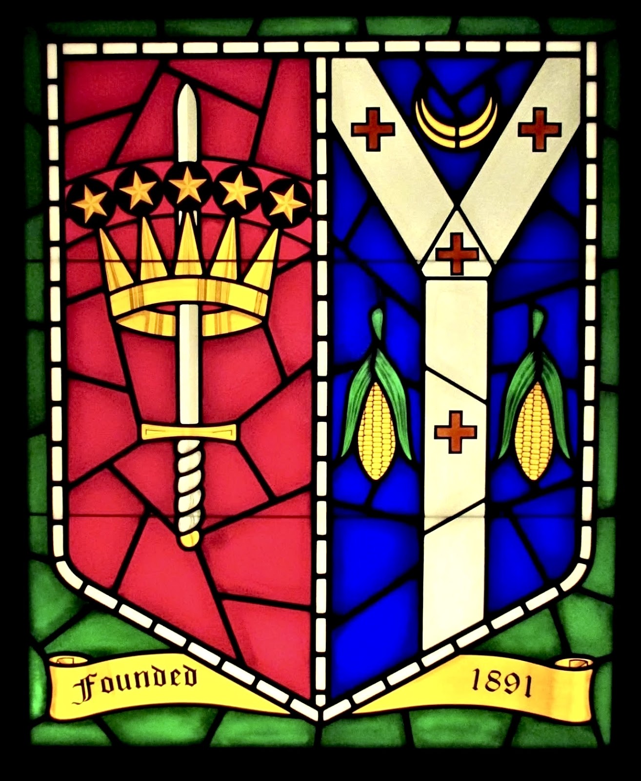
Image of the American Church Union coat of arms
Image source:  Woodruff (1936, November 11), page 621
Above is the original image published in the The Living Church article written by Clinton Rogers Woodruff (1868-1948) who served as President of the ACU and an attorney from Philadelphia.  Woodruff was actively involved in furthering the Anglo-Catholic movement within the Episcopal Church.  

Advertisement appearing as early as 1912
in Living Church Annual (1912), p.467
Woodruff (1936, November 11) notes this newly formed ACU was the outgrowth of two previous unions, one from the 1860s and the most recent version from 1908.  The article does not supply a blazon or design rationale for ACU's coat of arms, only noting the arms were previously borne by one of the earlier unions and seen in use as early as 1912.

 Side by side comparison of the arms of the United States of America
and those of the American Church Union
Rendered by Chad Krouse, 2025

In the absence of any additional known data concerning the arms of the American Church Union, we can render a few informed guesses as to the design rationale.

These arms represent the state of heraldry in the Episcopal Church at the turn of the 20th century--the very purpose Pierre de Chaignon la Rose (1872-1941) saw in his heraldic work to correct by creating simple, clear, and perspicuous heraldry.  

First, we know by the dates involved these arms predate the 1940 adoption of arms of the Episcopal Church.  The lack of any unifying national symbol for the Episcopal Church in the earlier 20th century likely caused the designer to use the arms of the United States of America as the basis to show the organization's national scope.  I believe that much is quite clear when comparing ACU's arms with those of the US as seen above. 

Coat of Arms of the American Church Union
Arms of the American Church Union
Rendered by Chad Krouse, 2025
Secondly, as to the charges on the cross quadrant, we're left to speculation as to their purpose.  Here's my working theory.  Given ACU's mission to preserve the 1) doctrine, 2) discipline, and 3) worship of the Episcopal Church in the Book of Common Prayer,  I think we can see a rationale beginning to emerge.

Doctrine could be illustrated by the seven red roses likely representing the seven sacraments of the Church, along with those three roses inverted surrounding the inescutcheon for the Holy Trinity.  The two gold bishop's mitres also likely represent discipline and authority.  For worship, I think, we see the blue fleur-de-lis in base which could represent the Blessed Virgin Mary and would strengthen the arms with a catholic purpose.

The blue inescutcheon with the Lamb of God might also be representative of worship, the heavenly banquet and aim of the Christian life.

I wanted to see if it was possible to revise the arms of ACU thinking and using those early mid-20th century resources for corporate heraldry.  Two possible revisions came to mind.

Two possible revisions for the arms of the American Church Union
Designed and rendered by Chad Krouse, 2025

The first idea of mine was to draw out the inescutcheon and work with the image of the Lamb of God while still incorporating the three ideas of doctrine, discipline, and worship.

Revision Example 1
Designed and rendered by Chad Krouse, 2025
Doctrine could be seen by the lamb standing on the barry wavy lines representing one of the many miracles Jesus performed during his earthly ministry--walking on water.  Discipline was again represented with the gold mitre of a bishop.  I liked the idea of the lamb embracing the mitre, showing the Church's tenderness and care for the ministry of the historic episcopacy.  

Pennon or flag designed by Chad Krouse, 2025
Click to Enlarge
I wanted the pennon or flag to show two references at once: creating a national symbol by placing the red and white bars horizontally to represent the flag of the United States and adding the chalice and host for both catholicity as well as for worship.  I felt this design gave a national symbol more readily recognizable to many by playing on the national flag.  

The chalice and host design has been used historically by Anglo-Catholic organizations and congresses, likely for the centrality of the Eucharist in the life of the Church.  I believe this image would also provide clearer references to ACU's catholic aims.

Admittedly, this design is still busy while attempting to simplify all the references made within ACU's arms.

Revision Example 2
Designed and rendered by Chad Krouse, 2025

The second idea emerged as my preference of the pair.  With this design, I wanted to strip away as much fussiness as possible with a clear and simple design.   

Side by side comparison of two design ideas
Designed and rendered by Chad Krouse, 2025

Using the arms of the US as the basis to form the bordure would provide a reference to the national scope of the organization, while the chalice and host in pale provides clear catholic identification which would likely have been known to many at that time.  I think it could be argued that doctrine, discipline, and worship can all three be represented in a singular "catholic," emblem of sorts.  I believe all three are implied.  Regardless, the chalice and host create a simple and clear design.  

Had the Episcopal Church's coat of arms been designed then,
here's an example of using those as the bordure.
Designed and rendered by Chad Krouse, 2025

I had two versions in mind here:  one to place the fleur-de-lis on the chalice playing on the Blessed Virgin Mary's role in the Incarnation (a very catholic position), or even more simply to have the monogram of the Holy Name placed on the host.

I think either would work, but the latter is becoming my favorite.

My favorite version of the revised arms of ACU
Designed and rendered by Chad Krouse, 2025

In summary, the arms of the American Church Union represent the state of heraldry in the Episcopal Church at the turn of the 20th century and underscore the need for a unifying national church emblem.

La Rose's emergence on the heraldic scene would help steer the fanciful impulses for heraldry towards a more simpler and dignified approach, employing a systematic framework for designing new corporate arms while establishing a standard for others to later follow.


Works Cited

Living Church Annual (1912).  The Living Church Annual and Whittaker's Churchman's Almanac.  Milwaukee: The Young Churchman Company. 

Woodruff, Clinton R. (1936, November 28).  An earlier Church Union.  The Living Church, 621-622.

Wednesday, April 2, 2025

New Arms for the Episcopal Parish of Alton and its Rector

The coat of arms of Episcopal Parish of Alton
The newly adopted coat of arms of the Episcopal Parish of Alton
Designed and rendered by Chad Krouse, 2025
It is quite humbling when someone compliments your art work; even more so when it becomes the identity of an entire community.  I am thrilled to share the newly adopted coat of arms for the Episcopal Parish of Alton in Alton, IL.  The Rector is a dear friend and I wanted to help as he establishes his new ministry as Rector.  Somehow, I managed to convince him to adopt arms too.

Following the framework for corporate heraldry used by Pierre de Chaignon la Rose (1872-1941), the design for these arms came readily to mind--my own mental "refrigerator test."  In other words, when I struggle to construct a coherent design, I know the time isn't right just yet.  On the other hand, there have been many instances when the design becomes immediately clear to me--those designs are the best.  The arms of the Episcopal Parish of Alton came to mind rather quickly, a positive indication for a prospective coat of arms.

Infographic from the proposal
Click image to enlarge

In a nutshell, la Rose's goal in creating corporate arms was to layer as many references identifying the owner while keeping the design simple and clear.  One charge--or in "la-Rosian" style, charge-on-charge--could combine multiple references to the corporate body without fuss.  

Since the Episcopal Parish of Alton combines two historically independent parishes, St. Paul's and Trinity, I knew there was a solution honoring the heritage of both while creating something new in the process.

The blazon I landed on seemed clear and reasonable to me.  It combined references to the dedication of both parishes with the sword in pale for St. Paul and three paddle wheels for the Holy Trinity.  Moreover, the chevron makes a nice image of two separate sides coming together at one point, and I felt satisfied in honoring the two communities.  The paddle wheels and barry wavy lines on the chevron reference the parish's location along the Mississippi River and honors local history.  

The blazon for the arms of the Episcopal Parish of Alton: Gules, a sword in pale Argent point to base hilt and pommel Or debruised by a chevron barry wavy Argent and Azure fimbriated Or with three paddle wheels of the field.

Applications for Identity 

Example of business card
Example of letterhead
I wanted to design a simple word mark incorporating the new arms to help reinforce its use within the daily life of the parish.  For example, the two images above show the coat of arms and word mark used to create official parish stationary, such as business cards and letterhead.  

Armorial flag, processional banner, and seal designed for the Episcopal Parish of Alton
Armorial flag, processional banner, and seal designed
for the Episcopal Parish of Alton
Designed and rendered by Chad Krouse, 2025
Countless applications come to mind for the new arms:  coffee mugs, lapel pins, automobile stickers, tee shirts, and the list of merch goes on and on.  Because these files are rendered in vector, the sky is the limit for adding this new dignified decoration to almost anything.  

Cover page of the proposal
Designed and rendered by Chad Krouse, 2025

I believe it is critically important that all members of the corporate body have the ability to inhabit their organization's coat of arms--be that on a Christmas ornament or cufflinks, owning a piece of the corporate brand only serves to strengthen and sustain it. 

This was a fun project for me and I'm delighted that the parish will use these designs in one way or another.  I am thankful that I can begin to share my work freely for good use.  My goal is to help smaller parishes either adopt new coats of arms to be used as branding, or help update current digital assets with vector files for use in social media, web design, and so on.  The rationale is that these faith communities would likely not spend money on this sort of project--I've found my niche for ministry and a special way I can serve.  

New Coat of Arms for the Rector


The personal coat of arms of the Rev. Garron Daniels, OCS impaled with his parish
Designed and rendered by Chad Krouse, 2025

Not only was I able to have my first parish coat of arms adopted, I designed arms for the Rector too.  

Arms: Argent, on a fess Sable two Mayflowers (epigaea repens) Argent barbed Vert charged with a fleur-de-lis Azure debruised by a pile Azure thereon a dove descending Argent haloed Or;

Motto: Dum Spiro Spero, “While I breathe, I hope”

Design Rationale: The new armiger is an ordained priest in the Episcopal Church, and referenced through the clerical color of black for the fess. The fess is charged with two Mayflowers (epigaea repens) honoring the armiger’s ancestor, William Bradford (1590-1657), who emigrated from England and arrived at Plymouth Colony aboard the Mayflower in 1620.

The flowers are charged with a fleur-de-lis representing not only the City of St. Louis where his ministry began, but also his devotion to the Blessed Virgin Mary. Additionally, the fleur-de-lis is used as the crest in the armiger’s order, the Order of Christ the Savior.

The blue pile represents the limitless heavens above as the dove of peace descends offering grace, healing, and hope in the world today. The motto is attributed to King Charles the Martyr, representing another saintly model for the armiger.

Date: 10 January 2025

The cleric's arms are ensigned by a black galero, cords alternating white and black, and ending with one tassel to indicate his priestly office.  As a guideline, I followed the Earl Marshal's Warrant of 1976 which authorized clergy in the Church of England to ensign their arms with ecclesiastical hats following a prescribed "annex schedule."  To read the Earl Marshal's Warrant of 1976 regarding the use of ecclesiastical hats, click this link to view the document on the College of Arms website.

Canterbury & York

Coat of arms of the Archbishops of Canterbury and York, Church of England
Rendered by Chad Krouse, 2025
To continue exploring the world of ecclesiastical heraldry in the Episcopal Church, I want to explore the two archiepiscopal arms in the Church of England--those of Canterbury and York.  This whole post stems from running across a version of an armorial flag for Canterbury that I'd not seen previously...

It seems one cannot discuss the ancient arms of the See of Canterbury without acknowledging the arms used by the Roman Catholic Archdiocese of Westminster.
Coat of arms of the Archdiocese of Westminster
Coat of arms of the Archdiocese of Westminster (Roman Catholic)
revised in 2014
Rendered by Chad Krouse, 2025
The Heraldry Society posted an excellent article on the arms of the Roman Catholic Archdiocese of Westminster which offers some details and history around these arms. Please click this link to read the article on the The Heraldry Society website.

Side by Side: the arms of the Roman Catholic Archdiocese of Westminster (left)
and the Archbishop of Canterbury in the Church of England (right)
Rendered by Chad Krouse, 2025
I've also learned that in 2014, the Archdiocese of Westminster, in fact, revised its coat of arms to appear as they do in the above illustration.  What changed?  The archiepiscopal cross found in pale behind the pallium was removed and placed as an external ornament, because the cross required two cross bars reflecting the see's metropolitical authority.  Click this link to read about the change on the Archdiocese of Westminster website.

Two versions of the archiepiscopal staff from the arms of Canterbury and the two bar 
staff carried by the Presiding Bishop of the Episcopal Church
Rendered by Chad Krouse
Finally, I know now that the archiepiscopal cross in the arms of Canterbury predates the use of two bar crosses to identify metropolitans.  All this from seeing a flag online!  
Coat of arms of the Archdiocese of Canterbury
Coat of arms of the Archbishop of Canterbury
Rendered by Chad Krouse, 2025
Admittedly, I've not thought a whole lot about the design for these arms, taking them for granted I suppose.  Initially I thought the pall was the ordinary in the form of a pall cross rather than a charge.  This fact is new and interesting to me.  Especially when considering these arms as an armorial flag.

The See of Canterbury (Cantaur) is the senior archiepiscopal office in the Church of England, followed by its junior partner, the See of York (Ibor).

The blazon for the arms of the Archbishop of Canterbury: Azure, an archiepiscopal staff in pale Or surmounted of a pall Argent fringed of the second and charged with four crosses patee fitchee Sable.

Possible armorial flag for the Archbishop of Canterbury
Rendered by Chad Krouse, 2025
The scholarly world of the Internet showed me an image of these arms as a flag during my search and I was rather stunned.  It was the image of the flag that caused me to hunt down the blazon to see what's going on.  There is no pall cross ordinary.

So, I'm inclined to believe that the illustration above does in fact work when translating these arms into a flag.  

Armorial flag of Sewanee: The University of the South
Rendered by Chad Krouse, 2025
Here's an example to clarify what I mean.  The arms of the University of the South (Sewanee) in Sewanee, TN has a pall cross as the ordinary in the design and overlaid with the "Sewanee" tressure.  If Canterbury's arms used the pall as the ordinary, the armorial flag would translate much like Sewanee's flag above.  Make sense?  All this was new to me and I simply wanted to share.

Armorial flag and coat of arms of the Archbishop of Canterbury
Rendered by Chad Krouse, 2025
One important point to remember when considering ecclesiastical flags in the Church of England is the Earl Marshal's Warrant of 1938, which codified the design and arrangement for flags within the provinces of Canterbury and York.

Let's say St. Swithun's by the Swamp (always a go to example in seminary) wants to fly a flag from the church tower.  The parish is situated within the boundary of the Diocese of St. Albans and under its authority.  Furthermore, the diocese is located within the Province of Canterbury in the Church of England.
Coat of arms for the Diocese of St. Albans
Coat of arms for the Diocese of St. Albans, Church of England
Rendered by Chad Krouse, 2025
According to the Earl Marshal's Warrant of 1938, St. Swithun's flag must adhere to these guidelines:  the flag will consist of a white field with the red St. George cross throughout, and in dexter canton the arms of the diocese where the parish resides.  The illustration below would be the proper flag for our fictitious parish to fly. 

Armorial flag of the Diocese of St. Albans
Rendered by Chad Krouse, 2025
As a complete aside:  I assert that the Earl Marshal's Warrant of 1938 likely influenced the final design for the coat of arms of the Episcopal Church, which officially adopted its arms in 1940.  To read the whole saga of how the Episcopal Church adopted arms, please click here for my article.

Armorial flag of the Province of Canterbury
Rendered by Chad Krouse, 2025
Yes, I suppose the arrangement also works for both Canterbury and York, but its rather drab, all things considered.  I prefer the initial design with the pall and archiepiscopal staff.  If I was the Rt. Hon. Rt. Rev. Archbishop of Canterbury, I'd be on the phone with Garter to plead my case!

Coat of arms of the Archdiocese of York
Coat of arms of the Archbishop of York
Rendered by Chad Krouse, 2025
I'm fortunate to say that I've been inside York Minister in the City of York.  The minister is huge!  I hope one day to be equally as fortunate to make a pilgrimage to Canterbury Cathedral.  The City of York itself, as I recall, is filled with heraldry.

Possible armorial flag for the Archbishop of York
Rendered by Chad Krouse, 2025
The arms of the Province of York are simple and clear, so long as we don't get into the Gules and pall with archiepiscopal staff...

Flags of the Provinces of Canterbury & York
Rendered by Chad Krouse, 2025

Tuesday, April 1, 2025

Recent Finds X

Coats of arms from various parishes and cathedrals in the Episcopal Church
Rendered by Chad Krouse, 2025

Part 10 of Recent Finds showcases several more coats of arms from parishes and cathedrals in the Episcopal Church discovered online.  To read more in the Recent Finds series, click the corresponding label at the end of this post.  I'm beginning to believe that St. Andrew and St. James win the popularity contest for being dedicated to the most Episcopal parishes.

Key to illustration above:

Top Row (L-R):  St. Mary's Episcopal Cathedral (Memphis, TN), St. Michael's Episcopal Cathedral (Boise, ID), and Calvary-St. George Episcopal Church (New York, NY)

Middle Row (L-R): Grace Episcopal Church (Spring Hill, TN), Prince of Peace Episcopal Church (Dallas, PA), and The Episcopal Church of St. Andrew and Holy Communion (South Orange, NJ) 

Bottom Row (L-R): St. Andrew Episcopal Church (Kokomo, IN), St. James Episcopal Church (Fairhope, AL), and Grace-St. Luke's Episcopal Church (Memphis, TN).

Coat of arms of St. Mary's Episcopal Cathedral Memphis, TN
Rendered by Chad Krouse, 2025

I'm admittedly somewhat conflicted with this design, knowing there's a great rationale and explanation for the arms.  I simply cannot locate one online at the moment.

Coat of arms of St. Michael's Episcopal Cathedral Boise, ID
Rendered by Chad Krouse, 2025

The arms of St. Michael's Cathedral are bold and impressive.  The bells, according to DeKay (1993) reference the first sounds of the Church ringing in the Boise area.

Coat of arms of Calvary-St. George Episcopal Church New York, NY
Rendered by Chad Krouse, 2025

Clean and simple, the arms of Calvary-St. George Episcopal Church do not disappoint!

Coat of arms of Prince of Peace Episcopal Church Dallas, PA
Rendered by Chad Krouse, 2025

The arms of Prince of Peace Episcopal Church are quite stunning in my opinion--someone knew what they were doing when designing these arms for the parish.

Blazon for the arms of Prince of Peace Episcopal Church Dallas, PA:  Ermine, on a cross quadrate throughout Vert a dove descending Argent haloed Or with an olive branch in its beak Proper.

Coat of arms of The Episcopal Church of St. Andrew and
Holy Communion South Orange, NJ
Rendered by Chad Krouse, 2025
The arms of St. Andrew & Holy Communion suitably differenced the attributed arms of St. Andrew while providing clear identification of the parish.  Simple and clear. 

Coat of arms of Grace-St. Luke's Episcopal Church Memphis, TN
Coat of arms of Grace-St. Luke's Episcopal Church Memphis, TN
Rendered by Chad Krouse, 2025

I like how the anchor is differenced here, just wish the feather quill pen was placed differently or omitted altogether.  A lovely coat of arms nonetheless.

Friday, March 28, 2025

Recent Finds Special Edition: Impaled Parish Arms

Cover of "Cookbook: Centennial Edition," by
Saint Paul's Episcopal Church, Kansas City, MO
Image source: eBay
As the Recent Finds series continues, I'm presenting a special edition from a rare find.  The purpose of the series is to seek and find sound heraldry used in the Episcopal Church to better understand how the American heraldic tradition has been shaped, and to prove this ancient art is alive and thriving in the US today.  To read other articles in the Recent Finds series, click on the corresponding label at the end of this post.  

Cookbooks.  That's right, cookbooks.  These bindings of locally loved recipes were something of a phenomenon in the Episcopal Church during the mid-to-late 20th century, produced mostly by parish ECW groups as a fundraiser for the church.

During a recent Internet search for parish coats of arms, I happened upon one such work from St. Paul's Episcopal Church in Kansas City, Missouri with the most unusual cover.  An impaled coat of arms!  Seeing an impaled coat of arms in the Episcopal Church, let alone one for a parish, is a rare find.  

Applied arms
Image Source:  Parish's Facebook Page

In case the arms depicted on the cookbook's cover were merely a one-off design, I dug a little deeper to see if this impalement exists and really used by the parish.  These are used and cherished!  I especially love the doormat.

Arms of St. Paul's Episcopal Church in Kansas City, MO depicted in stained glass
Image Source: Parish's Facebook Page

These arms are used and loved by the parish--the stained glass window depicted above is gorgeous even if  the crescent is blazoned as Argent rather than Or.  Well, too late to change that I suppose.

Attributed coat of arms of St. Paul
Rendered by Chad Krouse, 2025
Heralds have throughout history given saints attributed coats of arms for heraldic identification.  Most often, these attributed arms have been used for decoration on altar reredos, stained glass windows, and carvings found throughout Christian churches in the West.  These armorial ensigns provide unique identification for the saint.  For those martyred, the implements causing death are almost always included in the design

Saint Paul never bore a coat of arms himself but has been attributed arms widely recognized with a sword and an open book inscribed in Latin, Spiritus Gladius (sword of the Spirit).  

That St. Paul's Episcopal Church in Kansas City, MO successfully differenced the attributed arms of its dedication shows that someone knew what they were doing when creating arms for the parish.  

Blazon for the attributed arms of Saint Paul:  Gules, a sword in pale with point to base pommel and hilt Or surmounted by an open book edged with three clasps Or inscribed SPIRITUS GLADIUS

Coat of arms of St. Paul's Episcopal Church, Kansas City, MO
Rendered by Chad Krouse, 2025
Repositioning the sword with its point now to chief, dispensing with the open book, and incorporating a golden celestial crown provides three distinct marks of differencing the attributed arms of St. Paul.  Huzzah! 

Technically, I believe, the parish could simply use this coat of arms without impalement.  The heraldic designer could have simply stopped here.  I wonder if the desire to add the arms of the diocese was requested or there was a need to "ju-ju" the arms to look more decadent.  Who knows, we only have a cookbook to go by at this point. 

Blazon for the arms of St. Paul's Episcopal Church, Kansas City, MO:  Gules, a sword in pale pommel and hilt Or with point to chief surmounted by a celestial crown Or.

Coat of arms of the Episcopal Diocese of Missouri
Coat of arms of the Episcopal Diocese of West Missouri
Rendered by Chad Krouse, 2025
Originally known as the Episcopal Diocese of Kansas City, the process for securing a design of arms to be used as a seal began in 1906 (Diocese of Kansas City, 1909, 41).  During its convention in the summer of 1909, the appointed Committee on Diocesan Seal presented for a vote its recommendation for a coat of arms.  Designed by Pierre de Chaignon la Rose (1872-1941), the arms of the see pack a lot of references as simply as possible in a way only the talented la Rose could manage.  

La Rose supplied his rationale to the Committee which presented it before the Convention:
"My first desire was, if possible, to introduce some symbol from the arms of the State of Missouri, which consist (apart from the impalement of the United States arms) of a crescent on a blue field, in chief, and a bear on a red field, in base. I have chosen the crescent. (1) because by its position 'in chief' it is the more important figure heraldically: (2) because it has a religious significance on an ecclesiastical coat, being one of the symbols of the Blessed Virgin Mary: (3) because the bear has little ecclesiastical meaning, except as a symbol of St. Bernard or of the animals which devoured the revilers of the prophet.

"Looking at the map of Missouri it struck me as interesting to note that at Kansas City the Missouri and Kansas rivers meet in the form of an heraldic charge, viz. the 'pairle (or pall) Y. This as an heraldic charge should not be confused with the actual pallium which appears on the arms of the see of Canterbury, which last is the pallium as actually worn, whereas the pairle is simply an abstract form following the same lines, and which, while it suggests the vestment, yet has not archiepiscopal significance. I have placed, then, a silver pairle on a blue field, with the silver crescent in chief, as a very definite representation, in the recognized astract forms of heraldry, of Kansas City in Missouri.

"In the flanks I have placed pendent ears of maize to indicate that the Diocese is situated in the midst of a great corn-growing district. As precedents for these pendent ears, one can refer to the colonial seal of the Province of East Jersey, and to the present arms of the Diocese of Athabasca, on both of which appear ears of maize in this pendent position.

"Finally, I have placed on the pairle four small St. George crosses, just as the Canterbury pallium is charged with four black crosses 'pattes.' By these St. George crosses we can definitely indicate the Anglican Communion in Kansas City, Mo., and we use four of them as the old Canterbury number (and there is nothing to prevent one from considering the number to represent the Lambeth Quadrilateral)" (Diocese of Kansas City, 1909, 41-42).
La Rose's blazon for the arms of the Episcopal Diocese of West Missouri:  "Azure, between in chief, a crescent argent, and in flanks, two pendant ears of maize leaved and slipped or, a pairle of the second, thereon four crosses gules" (Diocese of Kansas City, 1909, 41).

My version of the blazon for the Episcopal Diocese of West Missouri:  Azure, on a pall cross Argent four crosses couped Gules between two pendant ears of maize Or in chief a crescent Argent. 

Example Coat of arms of St. Paul's Episcopal Church, Kansas City, MO
Example of best practice when incorporating the arms of the see
with a parish coat of arms
Concept and rendering by Chad Krouse, 2025
One idea of how to incorporate the arms of the see with those of a parish can be seen above.  By using the see's arms as the base design--effectively creating a "bordure of the Diocese of West Missouri"--and overlaying the arms of the parish, this method would be seen as a best practice or preference when these two arms collide.

I like this method as it plays on cadency in the Scottish heraldic tradition.  A bordure is used to difference the main coat of arms while distinguishing between younger sons and other cadet branches within a family.  In a sense, one could see the arms of St. Paul's as a "child" of the Diocese of West Missouri.    

Two becoming one: impaling two coats of arms
Rendered by Chad Krouse, 2025

The illustration above simply shows the two separate coats of arms being impaled into a singular coat.  In heraldic terms, the viewer's left side of the shield is called "dexter," and the right, "sinister."  

Coat of arms of St. Paul's Episcopal Church, Kansas City, MO
Rendered by Chad Krouse, 2025

Blazon for the impaled arms of St. Paul's Episcopal Church, Kansas City, MO:  Impaled: Dexter, Gules, a sword in pale pommel and hilt Or with point to chief surmounted by a celestial crown Or (St. Paul's Episcopal Church, Kansas City, MO).  Sinister, Azure, on a pall cross Argent four crosses couped Gules between two ears of maize Or in chief a crescent Argent (Episcopal Diocese of West Missouri).

Armorial flag of the Episcopal Church and St. Paul's, Kansas City, MO
Rendered by Chad Krouse, 2025
The impalement looks rather slick when translated into an armorial flag and banner.

Banner and coat of arms of St. Paul's Episcopal Church, Kansas City, MO
Banner and coat of arms of
St. Paul's Episcopal Church, Kansas City, MO
Rendered by Chad Krouse, 2025
So who knows the backstory for these arms?  I'll see what I can learn and will report back any findings.  It is indeed a lovely coat of arms.

__________________

Thank you St. Paul's for sharing my work as I hope to keep alive your parish community's cherished coat of arms.    
Post from E-pistle: News From St. Paul's
Friday, May 16, 2025

Works Cited

Diocese of Kansas City. (1909).  Journal of the twentieth annual council of the Church in the Diocese of Kansas City.  Diocese of Kansas City, 41-42.