Recent Posts

Wednesday, August 6, 2014

The Arms of the College of William & Mary


The Arms of the College of William & Mary
Williamsburg, Virginia 

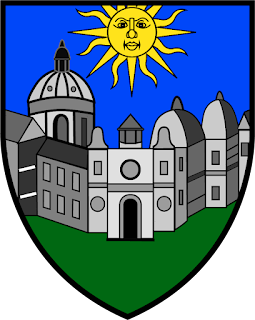
One can hardly discuss scholastic heraldry in the US or even the Commonwealth of Virginia without mentioning the arms of the state's oldest institution of higher learning, the College of William & Mary located in Williamsburg.  Granted by the College of Arms in London on May 14, 1694, the arms are blazoned:  "Vert, a colledge or edifice mason'd argent; in chief a sun rising or the hemisphere proper, as in the margent hereof is more plainly depicted."  (Donald M. Sweig, "Vert a Colledge...:A Study of the Coat-of-Arms and Seals of the College of William and Mary in Virginia," The Virginia Magazine of History and Biography, Vol. 84, No. 2, April 1976, page 143).  Jack E. Morpurgo gives the blazon as, "Vert, a colledge or edifice mason'd argent in chief a sun rising or" (Their Majesties' Royall Colledge,Washington, DC: Hennage Creative Printers, 1976, 36). 

I am somewhat conflicted about these arms.  I'm reminded of L.G. Pine's statement regarding good heraldry and the legitimacy of arms--just because they're legally granted does not mean that they're good arms.  With the opening of a new colony, new resources, new everything, I suppose the heralds were not inclined to change convention with regards to new charges. Is it a coincidence that the "colledge" looks a bit like Oxford?  The brilliance of the sun seems overshadowed by a depressed star.  In some way, I suppose the heralds saw the new world with the cracked lens of the old; heraldry was not going to take off in a new direction and create any new trends.  Not then, at least.

It is worth noting that the college changed their seal, dropping these arms, in favor of a republican-looking temple which has been recorded on an honorary degree granted March 6, 1790 (Sweig, 146).  Moreover, the seal of Virginia also changed in 1776.  Sweig recounts this poignant quotation from Lyon G. Tyler (1894):

"The Revolution was, in Virginia, a revolution not only in government, but in church, education, and sentiment generally.  Monarchy in every guise became odious.  The Roman Republic presented at that time the highest exemplars of virtues and heroism known to history...Heraldry, the history of pedigrees, fell into utter disrespect" (Sweig, 146).

Eventually, however, the arms granted by the Herald's College would resurface as the official arms used for the seal of the college.

Another grant of arms from London came a few months prior to the college's, those of Francis Nicholson (1655-1728) who would later serve as Governor of the Province of Virginia among other offices.  Nicholson was also a founder of the college.  His arms are blazoned: "Azure, on a cross argent between four suns or, a cathedral church gules" (Morpurgo, 36).  Below is a sketch of Nicholson's arms as found in The New England Historical and Genealogical Register1885, Vol XXXIX, page 73.


The Arms of Francis Nicholson (1655-1728)
Granted March 9, 1694

This should help give a sense of heraldry at the close of the Seventeenth Century.  All in all, I love history, especially Virginia history.  I am proud that this old Virginia institution is and has been such a force in the Commonwealth.  Whether or not I like their arms, of course, is irrelevant.

Monday, July 21, 2014

Commission for New Arms


Private commission, by the Author.  
Copyright 2014.

Arms:  Azure, semé of Masonic compasses erect Argent, a dexter hand couped erect of the second;

Crest:  On a wreath Argent and Azure, a Black Labrador head erased gorged of a collar Or clutching in its jaws a glove of the first;

Motto: "My Soul is Resilient."

A friend of mine asked if I would devise arms for him, and of course I jumped at the chance.  The design came to mind rather quickly, which surprised me.  These are classic canting arms as the hand is a pun on the armiger's surname.  The armiger is a Mason and I thought of a way to incorporate the compass from the Masonic symbol in a pattern, or seme.  I think they came out rather nicely!  The crest was also fun, as the armiger loves his Black Lab.  In the dog's mouth is a white glove, apparently another symbol found in Masonry.  The motto was a collaborative effort and accurately portrays the armiger's war cry.  He loves it and so do I.   


Monday, July 14, 2014

The Arms of Chad Michael Krouse


The arms of Chad Michael Krouse, copyright 2014.
Digital artwork by Steve Cowan, July 2014.

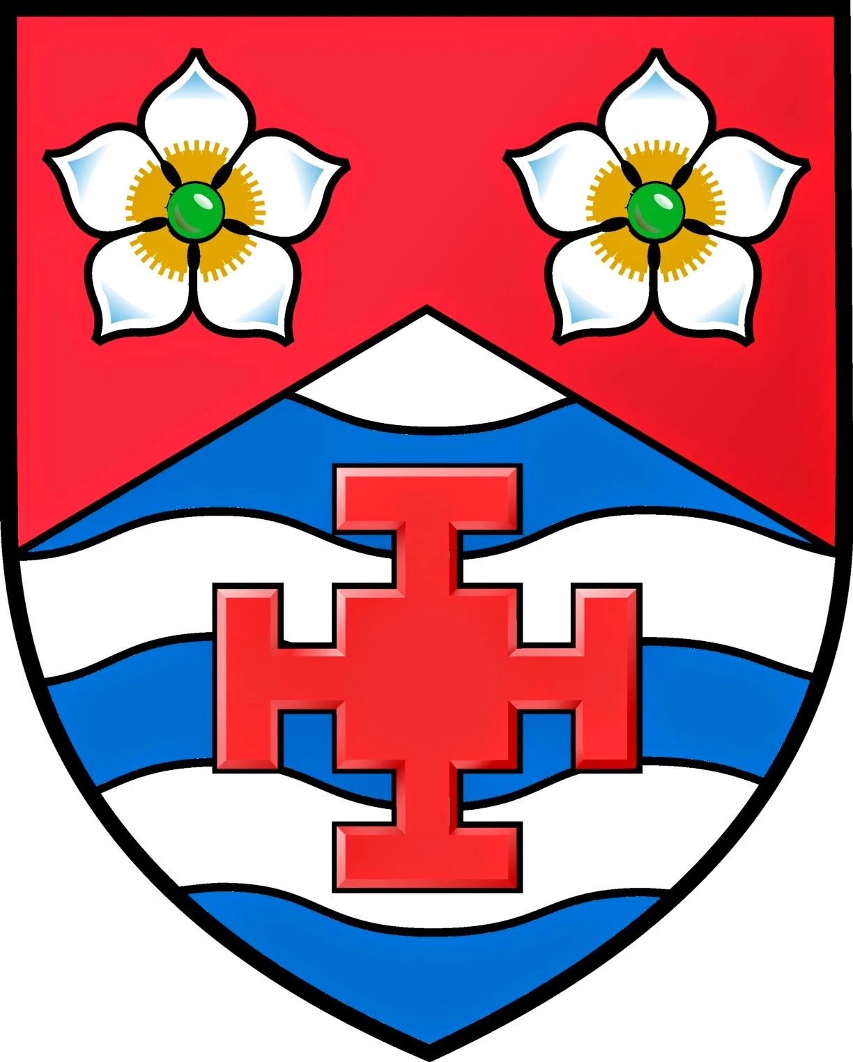
After months, and I mean months, of going back and forth over a design for arms, I finally have resolution. With the careful eye of Canadian heraldic artist, Steve Cowan, we designed the above escutcheon to impart something meaningful about me.  Steve was a treat to work with, and I highly recommend him.  The dogwood flowers, depicted as proper, represent the official flower of the Commonwealth of Virginia--my adopted state.  The Cross of Saint Chad is a pun on my name, as Saint Chad is also my patron saint.  The three bars, barry wavy, reflect my love of the water (especially fishing).  Fishing, my mid-life crisis hobby, was something I wanted to incorporate and had a few designs with fish hooks in saltire.

The Blazon

Arms:  Per chevron Gules and barry wavy Argent and Azure, 
in chief two dogwood flowers (cornus florida) proper and in base a cross of Saint Chad of the first; 

Crest:  On a wreath of Gules and Argent, a Cardinal's head (cardinalis cardinalis) erased clutching in its beak a Madonna lilly (lilium candidum) seeded proper;

Motto:  Ich Mache Recht.

My arms on a lozenge for my daughter.
Painted by Ceilidh Burdick, Ealeroi Studios, July 2014.

For some reason, it's always harder to create something for yourself as opposed to someone else.  Below is a colored pencil drawing of my complete achievement of arms.  I mistakenly opted for azure in the wreath and mantling.  It is blazoned, now, for gules (red).    

Achievement of arms, Chad Michael Krouse.
Colored pencil, by the author.  2014.

Since I had settled on the crest and motto long before the shield, I wanted to make certain that the final design worked in harmony with everything.  I believe this was achieved.  It is interesting to note that a lot of friends (Facebook) thought it looked off balance.  One even went so far as to suggest it looked like a crazy wrestling mask!  So it remains a fundamental truth that beauty is in the eye of the beholder.  For prior thoughts on the motto and crest, click here.


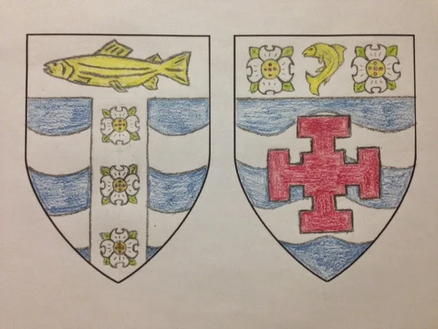
Early drafts in colored pencil.

Here's an example of some of the earlier drafts which struggled to incorporate too much stuff.  The medieval canon of heraldry demands a noble simplicity for ease of identification--these miss the mark.  

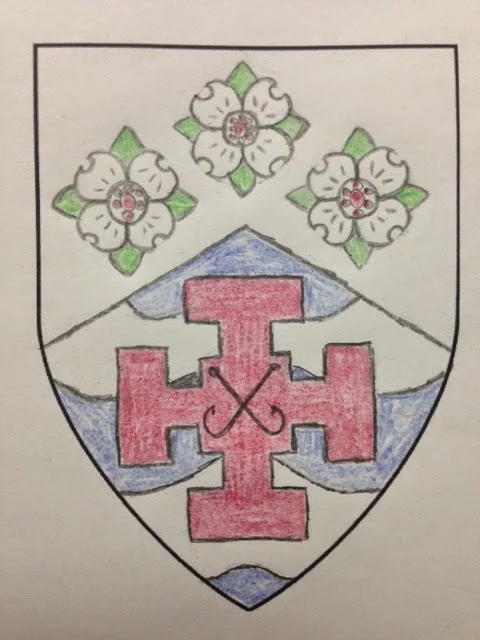
First draft with shield divided "per chevron."

This next image represents the first time I divided the shield "per chevron" but still cluttered up the chief with three dogwoods.  Moreover, I made a poor attempt to place a charge upon a charge with no real distinction between the two.  This was when I started to see the fish hooks in saltire which do look sharp.  


Again, another bad attempt with the chief, but I rather liked the fish hooks in saltire.  It was a struggle to decide between the Cross of Saint Chad or the fish hooks.  The cross won!  

I'm glad that I went through this lengthy process of give and take.  It afforded me time to really flesh out what I wanted and how I wanted to be identified vis a vis coat armour.  I'm extremely happy with the final design and am ready to proudly display my arms.  

_____________________

Epilogue

It's now 2020, and looking back at this post has been touching, to say the least.  One critical thing to note, here, is that when the first emblazonment was completed, the wrong dogwood flower was used!  Yes, it's wrong!  The heraldic artist lives in Canada and had a Canadian version on his mind, which is completely understandable.  We made a quick update with the appropriate version for Virginia. 


Friday, June 20, 2014

Pierre de Chaignon la Rose and the Mystery of Saint Edward's Seminary

 
"Friends of St. Edward State Park"
Pencil, by the author.

As I was searching the web for resources on the heraldic work of Pierre de Chaignon la Rose (1872-1941), I came across a blog post from the Friends of Saint Edward State Park in Kenmore, Washington.  Once upon a time, there was a seminary founded by the Society of Saint Sulpice in the Archdiocese of Seattle. The seminary was dedicated to Saint Edward the Confessor and la Rose was enlisted to devise arms for the school.  Constructed around 1931, the 316-acre property was to house the seminary.  It closed in 1977. Now, the grounds have been turned into a state park and is supported by a group of local citizens.

Through some research, the group identified a drawing for arms executed by la Rose along with a letter, all of which are reportedly held in the archives of the archdiocese.

la Rose's draft shield for Saint Edward's Seminary
Source: Blog Posting of 31 Aug 2013

The blog posting from 31 August 2013 contains the following information from la Rose (the blog post has since been removed, and I'm glad I captured this data):
"Saint Edward himself has a very beautiful coat ascribed him by the medieval heralds-apocryphal, of course, as he lived before the rise of personal heraldry, but still, an actual emblem which he used on his coinage: a cross with five martlets.  This in conjunction with the Sulpician emblem, I shall make the basis of a carefully studied design.
The arms ascribed to Saint Edward by the early heralds consist of a gold cross and five gold 'martlets' on a blue field.  The shapes and arrangement are the same as in my own drawing.  We may not use this coat unaltered, for to do so would imply, heraldically, that St. Edward was the Founder of the Seminary, instead of being simply its Patron.  I have therefore changed the coloring from blue and gold to red and silver - the colors of the diocesan arms. As for St. Edward's cross and martlets, they appear, as I think I told you, on his coins.  The significance of the birds I do not know, nor does anyone else.  In heraldry they are always shown as having no feet visible. 
On the Sulpician 'inescutcheon' you will note the crescent (of the Immaculate Conception) which distinguishes the American house of the society from the French." 
From a letter of Pierre de Chaignon La Rose, 13 February, 1931
That is all that is known about the tinctures.  I wanted to see if I could recreate these arms and bring them to life for the benefit of the friends society.  I took license with the ineschutcheon, opting for azure to represent the Blessed Virgin Mary (which the Sulpician monogram represents) but left the charges all in argent.  I opted to shade this in as silver rather than leaving them stark white.  The banner surrounding the shield can be found in another of La Rose's work, the arms of Rice University.  Since I could not fit in the entire name, "The Friends of Saint Edward State Park," I again used artistic license to get the point across.  I selected the date of 2007, represented by Roman numerals (for the Roman Catholic nature of the place), because this is the date the property was added to the National Register of Historic Places.

Comparing the seminary's arms with those attributed to St. Edward the Confessor.
Rendered by Chad Krouse, 2024.
All in all, I love a challenge and enjoyed this.  While I'll never know if what I drew was correct in la Rose's mind, it doesn't much matter.


St Edward's seminary coat of arms
The arms of St. Edward's Seminary.
Rendered by Chad Krouse, 2024.
I have created the following blazon:  Gules, on a cross floury Argent an inescutcheon Azure charged with the Badge of the Society of Saint Sulpice in the United States between five martlets Argent.