


 |
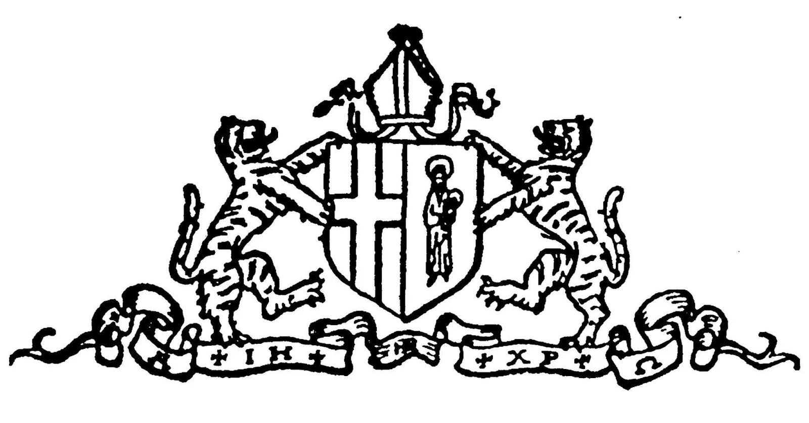
| Full achievement of arms, The University of the South Rendered by Chad Krouse, 2024 |
Founded in 1858, the University of the South, more commonly called Sewanee, is a gothic paradise located high atop the Cumberland Plateau in the town of Sewanee, Tennessee. Legally owned by 28 dioceses of The Episcopal Church (a peculiar only in America), Sewanee is wholly an Episcopal university comprised of the College of Arts & Sciences (the undergraduate college), the School of Theology (the seminary), and the newcomer on the block, the School of Letters, which awards graduate degrees in creative writing.
"The Domain," as campus is called, encompasses nearly 13,000 acres of natural beauty, where university buildings in Tennessee limestone blend seamlessly into the landscape. Described once to me as an "Episcopal theme park," the Domain is filled with academic buildings designed in gothic architecture, with one of the main campus' central towers, Breslin Tower, modeled on Magdalene College, Oxford--pronounced properly "Maudlin." The professors wear their academic gowns to class, and the whole place is a haven of the best of the Episcopal Church.
 |
| Arms of the Episcopal Church. Rendered by Chad Krouse, 2024. |
My three years as a seminarian at Sewanee were among the best in my life so far. I am very proud to have earned a master of divinity degree from this university and to call Sewanee my alma mater. Perhaps no place else provides the perfect backdrop to showcase scholastic heraldry quite like the neo-gothic campus of the University of the South.
Sewanee's heraldry, in many ways, is a model of best practice for US schools when employing heraldry in a dignified way in order to express the values of the institutional brand. To be clear, heraldry is not branding but can be used as an expression thereof. While it may have taken 123 years for the university to embrace heraldry, the outcomes are transformational. Generations of alumni, families, and faculty have symbols they can cherish and embrace.
To Seal or Not to Seal
The story of Sewanee's heraldry begins with the popular use of the university's seal. By definition, a legal corporate seal serves as the institutional authenticating signature on official documents; for colleges and universities the seal is appropriately used on diplomas, for example, attesting to the graduate's completion of requirements for the degree earned. Corporate seals do not have to be heraldic in nature, though some are. The seal of the University of the South, as seen above, was settled as late as 1977 but evolved over time since its first inception in 1872 (McCrady, 2009b; McCrady, 1981).
 |
| "Do not step here." The seal of the university emblazoned in the floor of All Saints' Chapel at The University of the South. |
The seal takes pride of place everywhere across the Domain, including a bronze emblazonment in the floor of the vestibule inside All Saints' Chapel--new students are warned to not step a single foot upon that sacred image, ensuring that they see their future graduation. Using the legal corporate seal for decoration on souvenirs can be problematic for any college or university and only serves to muddle the distinction and reservation of seals for official use by the institution.
In 1956, we see the first impulse for heraldry at Sewanee. The Rt. Rev. Richard Bland Mitchell (1887-1961), the Episcopal Bishop of Arkansas, pressured the university to stop using the legal corporate seal to, "validate souvenir china," for this very reason (McCrady, 1982, page 29).
 |
| Early version of the University's arms as found on the DuBose plaque inside St. Augustine's Chapel. Rendered by Chad Krouse, 2024. |
The bishop was successful in rallying the university's governing board to his cause and stated that the board, "objected to the Holy Ghost descending into beer mugs" (McCrady, 1982, page 29). The bishop's argument is the perfect reason to introduce heraldry as a means of creating dignified decorations for souvenirs.
An Increasing Need for Heraldry
McCrady (2009a) notes that in 1951, the first real instance of heraldry in use on campus came by way of the U.S. Air Force R.O.T.C. program which required a heraldic shield for use as uniform insignia. It was the Air Force that brought heraldry in whatever form, finally, to campus. Following these two impulses for heraldry, the university would mark its centennial celebration in 1957, and, "it was decided, following rather hastily the dictum of visual simplicity for the best heraldry, that the most obvious and simple shield for Sewanee would be the time-honored tiger" (McCrady, 2009a, 550).
 |
| Provisional arms of the University of the South ca.1957. Rendered by Chad Krouse, 2024. |
The provisional arms of the university prominently featured the heraldic tiger, as opposed to the Bengal tiger, with the body of a lion, the mane of a horse, and whose ears and beak were drawn to resemble a wolf (McCrady, 2009a, 550). The blazon for the provisional arms: Purpure, a tiger rampant Or.
From a letter in the University's Archives, dated August 1, 1957 from then Vice Chancellor Dr. Edward "Ned" McCrady (1906-1981) to the University's Board of Regents, McCrady provides a clear design rationale for the new arms along with the steps taken to ensure their correctness. Moreover, we learn in the announcement of the new provisional coat of arms that, "accordingly I have had my son Waring, make a drawing, a print of which is shown on the accompanying proof-sheet" (Letter from Vice Chancellor Edward McCrady to the University Board of Regents). Thus, we now know that Sewanee's first and proper coat of arms was rendered by none other than the future herald of Sewanee, Dr. James Waring McCrady (b. 1938). It is interesting to note that McCrady does not name himself--or anyone else for that matter--as the designer of these arms.
 |
| The coat of arms for McCrady of Sewanee. Rendered by Chad Krouse, 2024. |
Sewanee's heraldry would finally reach its zenith in 1981. Designed by Sewanee alumnus and French professor Dr. James Waring McCrady, the arms for the university and its subordinate schools are simply genius, reflecting through the abstraction of heraldry, the mission and values of this storied institution.
The 125th Anniversary and New Arms
In 1983, the university celebrated its 125th anniversary since its founding in 1858. In preparation for this milestone occasion, Dr. McCrady designed the arms for the university, the seminary, and the undergraduate college in 1981 (McCrady, 2009a). Away went the heraldic tiger, as he was moved outside of the shield to become a ferocious "supporter." Following in the footsteps of other great American heralds of scholastic heraldry--Orville Watson, Pierre de Chaignon la Rose, and Eric Hutchinson--McCrady developed a unique design for the "Sewanee tressure" to show unification within Sewanee's heraldry.
 |
| Arms of Kenyon College. Rendered by Chad Krouse, 2024. |
By creating new arms without the use of established coats, McCrady would avoid unnecessary controversy regarding designs that might allude to any founders of the university, which present day social and cultural issues could otherwise force uncovering baggage from the past.
 |
| The retired arms of Harvard Law School. Rendered by Chad Krouse, 2024 |
Halley (2022) covers precisely the arguments surrounding la Rose's 1936 design of arms for Harvard Law School which incorporated the undifferenced arms of Isaac Royall, Jr. (1719-1781) in the design. Harvard Law School dropped la Rose's design in 2016 and unveiled a new coat of arms for the school in 2021.
McCrady's tressure carried over the unbroken circular chain found in the university seal and transformed it into a tressure. Perhaps the most well known tressure can be found on the royal arms of Scotland which features the red double tressure with fleurs-de-lis.
By changing the fleurs-de-lis to "long crosses," McCrady visually shows the owning dioceses of the university linked together in harmony (McCrady, 2009a). As a scholar, McCrady likely appreciated the peer review process in order to have other experts from the field examine and critique his work. McCrady would submit his designs to both the College of Arms in London and to the Court of Lord Lyon in Scotland for advice and consent (McCrady, 2009a; McCrady, 1983).
McCrady (2009a) provides this detailed account:
"At last, it was decided to get serious for the 125th anniversary of the school. A set of arms for the Seminary, the College, and the University were drawn up, and in 1981 the designs were approved personally both by the Norroy and Ulster King of Arms, at the College of Heralds in London, and by the Lord Lyon King of Arms in Edinburgh...
"Since the precedent for this design [the Sewanee tressure] comes from the double tressures of Scotland...it was thought to seek Scotland's approval. The Lord Lyon granted it most cheerfully and suggested that the design be known as a 'Sewanee tressure'" (551-552).
The Sewanee tressure would be applied to the arms of the seminary and the undergraduate college to show their allegiance to the university.
In describing the arrangement and composition of a given coat of arms, the arcane Anglo-Norman language of blazonry is used universally for recreating a given design. While the blazon of a coat of arms is fixed for all time, the emblazonment or rendering is left to the heraldic artist who can stylize within the confines of the blazon. Blazons, in other words, help prevent future designs from infringing on existing arms.
|
| Full achievement of arms, The University of the South Rendered by Chad Krouse, 2024 |
The blazon for the arms of the University:
Arms: Purpure, a cross pall Or overall a double tressure long-crossed and counter long-crossed counterchanged;
Crest: Out of the coronet of a vidame, a dove holding in its beak an olive branch all proper;
Supporters: Dexter, a mountain goat Argent; sinister, a heraldic tiger Or.
Motto: Ecce Quam Bonum. Translated as "behold how good!" from Psalm 133: 1. From the Vulgate: Ecce Quam Bonum Et Quam Iucundum Habitare Fratres In Unum, or "behold how good and joyful a thing it is for brethren to dwell together in unity."
 |
| Arms, crest, and motto of the University of the South Rendered by Chad Krouse, 2024 |
The use of the pall cross, or the Y-shaped cross, was employed by McCrady because the cross is, "specifically symbolic of authority within a province of the church (and Sewanee stands as the center of the Sewanee Province, or Province IV [of the Episcopal Church])" (McCrady, 2009a, 554).
 |
| Arms of the Province of Canterbury in the Church of England Rendered by Chad Krouse, 2025 |
Moreover, it is a nice play on the arms of the archiepiscopal see of Canterbury, which prominently features the pallium, a material symbol of metropolitan authority within the church--the pallium mimics the cross pall.
 |
| Crest of the University of the South Rendered by Chad Krouse, 2024 |
From the university's full achievement, I am most drawn to the crest, or the portion of the achievement which rests on top of the shield. Most wrongfully confuse the crest for the shield, and this is incorrect. According to Fox-Davies (1978), the first known crest appeared in 1198, and the fanciful stories describing the history of the crest are both numerous and incorrect (page 326).
In particular, I admire the use of a vidame's coronet in the crest. The office of a vidame is an old relic from France where the title is derived from the Latin, vicedominus, or literally vice ("instead of") and dominus (lord or master). In feudal times, a prelate would designate a member of the laity to attend to certain judicial or other matters.
 |
| The University Badge conceived by Dr. McCrady Rendered by Chad Krouse, 2024 |
As a professor of French, McCrady would have likely known quite a lot about the office of the vidame and its symbolism. For McCrady, the use of the coronet in the university's crest makes a clear reference to the power of the laity within the church, "in a coronet symbolizing lay authority over church property stands the dove as proposed in 1870" (McCrady, 2009a, 554). The dove of peace was taken from the popular seal of the university and clinches in its beak an olive branch.
The Arms of the School of Theology
The University of the South
 |
| Arms, crest, and motto of the School of Theology Rendered by Chad Krouse, 2024 |
The blazon for the arms of the School of Theology: Gules on a cross or surmounted by a Sewanee tressure counter-changed a crossed fleam Sable.
Motto: Pius Doctus Utilis, translated as "Devout, Learned, Useful."
According to McCrady (1983), the colors gules (red) and or (gold) come from the arms of The Rev. William Porcher DuBose (1836-1918), who served as the second dean of the seminary. The crossed fleam in the center represents the patron saint of the seminary community, Saint Luke. Saint Luke was also the name of the seminary's first building on campus as well as the name of one of the chapels which can all be seen today. The Gospel writer is attributed as a physician, hence the use of the fleam which was a physician's implement for bleeding.
McCrady added the cross bar to the fleam in a most unusual way that gives dignity and significance to the design--typically in heraldry, the fleam is a stand-alone charge and McCrady's differencing of that symbol is purely masterful. To render the crossed-fleam in sable (black) not only alludes to the clerical color, but also to the Manigault arms, "the widow upon whose benefaction the seminary originally depended" (McCrady, 1983, page 30). I've dug deeper into these arms in another post. Please click here to read my analysis of the School of Theology's arms.
In 2024, the American Heraldry Society selected the seminary's arms to receive its annual Pierre de Chaignon la Rose Design Award. Click here to read the press announcement from the School of Theology.
The Arms of the College of Arts & Sciences
The University of the South
 |
| Arms of the College of Arts & Sciences Rendered by Chad Krouse, 2024 |
The blazon for the arms of the College of Arts & Sciences: Azure, within a Sewanee tressure three celestial crowns all Or.
For the arms of the College of Arts & Sciences, McCrady incorporated three celestial crowns within the Sewanee tressure rendering a rather dignified design. The celestial crowns were borrowed from the previously established coat of arms for All Saints' Chapel, and their arrangement based on the arms of Oxford University.
McCrady's simple and straightforward design for the undergraduate college underscores the primal canon of heraldry, simplicitas formae antiquitatis nota. The simplicity of the form as its known in antiquity should clearly identify the individual (or in this case, corporation) bearing arms. McCrady honored this maxim to the letter with all of his heraldic designs for the university.
The Arms of All Saints' Chapel
The University of the South
 |
| Arms of All Saints' Chapel Rendered by Chad Krouse, 2024 |
The blazon for the arms of All Saints' Chapel: Azure, a semmé of celestial crowns Or.
While technically not officially defined by the university's heraldry, the arms for All Saints' Chapel have been in use since the early 1960s. While no designer is named in McCrady (2009a), I fully suspect Dr. McCrady created these arms if we consider his humble omission of the designer behind the 1957 provisional arms.
There is one additional data point, however, that I cannot make sense of regarding these arms. In an undated document titled, "The Festival Banners Described," found in the University Archives, there is a description for a banner noted as the "Banner of All Saints'" which reads as follows:
"The Banner of All Saints'. Some years ago, Thad Holt, alumnus, had designed by the College of Heralds a flag for All Saints' Chapel. This banner is based on that design and depicts the crowns of the royal priesthood, the Communion of All the Saints, past, present, and future" (All Saints Chapel, n.d.).
All Saints' Banner
Rendered by Chad Krouse, 2025

It is remarkable that the College of Arms in London was engaged at some point in the 1960s for a design. Moreover, I believe "Thad Holt" referenced in the document above is Thaddeus Goode Holt, Jr. (1930-2019), who graduated from Sewanee in 1952 and was a Rhodes Scholar. Given Holt's exposure to heraldry during his time at Oxford--and later at Harvard Law School--the design referral to the heralds in London fits nicely.
Presently, there is a processional banner in use at All Saints' Chapel which has eight celestial crowns emblazoned on three strips of fabric. The number three either represents the Holy Trinity or perhaps the "communion of all the saints past, present, and future." Employing the number eight for the crowns is likely a reference to the "Eighth Day," or time-out-of-time which is the day reserved for the Resurrection. Baptismal fonts, including the one inside All Saints' Chapel, are octagonal for this very reason. I cannot confirm if this banner is the one referred to in the aforementioned document.
It is likely that we owe the use of celestial crowns as heraldic charges to represent the university's chapel to English heralds.
My view is that Holt's referral to the College of Arms gave the university precedence for employing celestial crowns, and McCrady created the chapel's arms by sewing the field with them--the semmé technique has French influence which we have previously encountered with the vidame's coronet in the university crest. Regardless, the arms of All Saints' Chapel illustrate the early history of heraldry at Sewanee and are thus included.
 |
| Arms of All Saints' Chapel with two croziers in saltire and ensigned with a bishop's mitre Rendered by Chad Krouse, 2025 |
Celestial crowns are crowns with stars, an illusion McCrady employed for the undergraduate college to show reference to All Saints' Chapel. The chapel is prominently situated at the very heart of the main academic campus and cannot be missed. These celestial stars, moreover, embody that ever-expansive constellation of heaven where all the Christian saints guide believers to the salvific glory of Jesus Christ.
The Arms of the Office of Chancellor
The University of the South
The University of the South
 |
| The arms of the Office of Chancellor Rendered by Chad Krouse, 2025 |
Near the high altar inside All Saints' Chapel hangs a singular curiosity carved in wood. I can only describe these arms as those belonging to the "office" of the Chancellor of the University of the South--a senior bishop from among the owning dioceses.
When I snapped a photo of these arms in 2014, I was baffled by their meaning. Why? Impaling a coat of arms indicates a "marriage" of sorts. For example, if a priest or bishop bears personal arms they may impale those with the arms of their charge--a parish or diocese. The arrangement traditionally is that corporate arms in dexter (left side) and the arminger's personal arms in sinister (right). So, if one believed that these arms were simply to indicate the university's relationship with the Episcopal Church, then most likely the order would be reversed--Church arms in dexter (left) and University arms in sinister (left) indicating the seniority/primary relationship is that of the Church rather than the university.
 |
| Carving of arms found near the high altar, All Saints' Chapel. Photo by the Author, 2014. |
The external ornaments of the crossed croziers with the primatial cross in pale adds even more confusion. The primatial cross is carried by the Presiding Bishop who technically has no responsibility or oversight of the University. One further context clue not photographed: the high altar area has stalls for each of the owning bishops of the University with the see's arms carved on each stall. So it makes sense, then, that the arms above are to indicate the Office of Chancellor.
Thus, each new Chancellor would impale arms with using the arrangement above while replacing those of the Episcopal Church with their personal arms. While these arms are not in use, nowadays the University's side would need to be updated with the pall cross and Sewanee tressure.
Blazon for the arms of the Office of Chancellor of the University of the South: Impaled. Dexter: Purpure, a heraldic tyger rampant Or (University of the South), Sinister: Argent, a cross throughout Gules, on a canton Azure nine cross crosslets in saltire Argent (Episcopal Church).
The Arms of the University Choir
The University of the South
 |
| Arms of the University Choir. Rendered by Chad Krouse, 2024. |
The arms of the University Choir: Impaled, (dexter) Azure, a cross throughout Argent, (sinister) Argent, the Blessed Virgin Mary aureoled Or holding in sinister arms the infant Jesus aureoled Or.
 |
| The University Choir with banner. Image source: University of the South. |
Here again, as with the arms of All Saints' Chapel, the armorial bearings for the University Choir would be considered unofficial but featured prominently on the choir's banner carried during services at All Saints' Chapel.
 |
| The arms of the University Choir as appearing on the choir's banner. My guess is the design was rendered in the 1940s to early 1950s. Image is from the University Choir's Facebook page. |
On the banner of the University Choir, the arms are supported by two Bengal tigers, a bishop's mitre is placed above the shield, and the arrangement sits on top of a scroll of ribbons containing the Greek letters found in the University's seal: the Alpha and Omega and IH XP for the name of Jesus. Taken as a whole, this heraldic arrangement suggests an earlier unadopted design for either the university itself or the chapel--perhaps a discarded sketch from an architect working on All Saints' Chapel. This arrangement of supporters and the bishop's mitre, in my opinion, is simply too elaborate for a minor foundation of the university.
I was unable to locate any documentation of sources for these arms other than the choir's banner as a point of reference. By using known data, we can render a guess regarding the rationale for these arms.
.jpeg) |
| The arms of Canterbury Cathedral. Image Source: The King's School Canterbury website. |
For the sinister (right) side of the choir's arms, there is precedence found in the arms of the Church of England's Diocese of Salisbury which features the Blessed Virgin Mary holding the infant Jesus on a blue field. However, in Salisbury's coat the Madonna holds the infant Jesus in her dexter (right) arms, wears a golden crown upon her head, and holds a scepter ending in a lily. The Madonna in the choir's arms holds the infant Jesus in her sinister (left) arms, and does not wear a crown or hold a lily scepter. Additionally, the choir's arms are suitably differenced by having the color of the field rendered as white/silver.
 |
| The arms of the Diocese of Salisbury, Church of England. Image Source: Clergy of the Church of England Database. |
If this early dating is the case, changing the design now risks diminishing a treasured symbol for many past and present choristers. While I am unable to attribute the designer of these arms, my guess in dating the creation of the choir's armorial bearings as seen in the line drawing above would likely fall between the 1940s to early 1950s. If the date range is true, then, the choir's arms would be the oldest continually used coat at the university and likely appropriated to the choir from an earlier design for arms to be used for the chapel. More research will be needed to better understand the history behind these arms.
Nonetheless, I have never encountered a fully colored emblazonment of these arms before, and it was a delight to get the University Choir's arms emblazoned. I include these arms within Sewanee's heraldry simply because they are used by the University Choir and displayed during each service. Given the generations, now, of alumni choristers who have beautifully given their talents to enrich the worshipping life of the university, it is clear that the University Choir's coat of arms is a cherished symbol of pride.
The Arms of St. Andrews-Sewanee
 |
| The arms of St. Andrews-Sewanee. Rendered by Chad Krouse, 2024. |
While not officially connected with the University of the South, St. Andrews-Sewanee is a school that is very much apart of Sewanee. For this reason I want to include their arms.
McCrady designed a seal and coat of arms for the school in the early 1980s. Unfortunately its proven impossible to find the blazon or a colored image of these arms--nor one with hatching for that matter. Additionally, several versions exist which incorporate lilies between the cross saltire. I've opted for the simplest version found on the cover of the school's 1985 yearbook, and its likely close to McCrady's original concept for the arms.
The blazon of the arms of St. Andrews-Sewanee (my best guess): Azure, in pale a sword Argent with point to base wreathed in oak leaves Proper, overall on a cross saltire Argent a roundel Argent edged Sable with a cross moline the extremity in sinister chief recercely Sable.
The Attributed Arms of the Sewanee Angel
 |
| The attributed arms of the Sewanee Angel. Concept and rendering by Chad Krouse, 2024. |
Throughout history, heralds have attributed arms to figures who never had the benefit of bearing coats of arms. And Sewanee has a lovely tradition involving angels, and these celestial guardians deserve heraldic representation.
The tradition goes like this: every time you leave the Domain you tap the roof of your vehicle in order to claim your Sewanee angel. Upon re-entry, you tap again to release your angel. The idea combines blue and white to divide the shield, in other words the heavens above. Wings are self-explanatory. The golden cross in the center represents the large memorial cross on the Domain.
The blazon: Per pale Azure and Argent, a pair of angel's wings conjoined in lure counterchanged, overall a passion cross Or.
In recent years, the heraldry of the university has finally been embraced as evidenced by a few events. In 2014, I wanted to see how Sewanee's heraldry would look displayed as armorial flags. Given all the pomp and circumstance of university ceremonies, I believed there had to be a way to increase the visibility of McCrady's heraldry. I posted several line drawings of how the arms would be laid out as flags on this blog back in September 2014, knowing full well no one in the world would take notice. I was wrong.
The Rev. Robertson "Rob" C. Donehue T'16, a seminarian at the time at the School of Theology, saw my post and sparked several conversations about Sewanee's heraldry. Rob's passion for Sewanee's heraldry, along with his savy leadership, brought my humble sketches into reality. My dream of seeing Sewanee's heraldry come alive and "fly," was simply made possible by Rob. By the university's Easter 2015 commencement, all three flags were up and flying (Steele, 2016 April 16). Please click here to read The Sewanee Purple's article. I am incredibly thankful for Father Rob and the work he did as a seminarian, and we still correspond about these very topics.
___________________________________
The Armorial Flag and Banner
What is the difference between an armorial flag and an armorial banner? The term banner can be tricky when describing either one, loosely speaking it's not an incorrect descriptor. While there is a lot of history surrounding both, here is my simplified explanation.

Armorial flags are heraldic ensigns appropriated for outdoor use and typically used by corporate bodies. Sometimes called "banner of arms," the design from within the shield is merely laid out in a rectangular form. The armorial flag often uses a ratio of 2:3; however, the flag of the corporate sole and its foundations are rendered longer in length to show its importance in relation to any other flags. Thus, I prefer the term armorial flag to describe this method of flying heraldry--it is by far my favorite.

In the modern era, armorial banners are usually square in shape and may include fringe around the border--which does not have to match livery colors. Nowadays, armorial banners are typically flown indoors though historically were carried on the battlefield to identify the otherwise unknown knight hidden beneath his armor. The banners displayed inside Westminster Abbey identifying Knights and Dames of the Order of the Bath, and those inside St. George's Chapel at Windsor Castle for members of the Order of the Garter, are just two examples of how armorial banners are used today.
___________________________________
Unfurled and flying, the heraldic flags at Sewanee inspired further developments for the campus. During the Fall of 2018, Dr. McCrady unveiled his designs of armorial flags for all the undergraduate residence halls on campus (Prior, 2018 October 16). Click here to read about the new flags in The Sewanee Purple. Here again, McCrady's simplicity for design is carried over from the university heraldry into the arms of the residence halls, and giving residents cherished symbols of community.
 |
| The armorial flags of the undergraduate residence halls flying prominently inside McClurg dining hall. Image source, The Sewanee Purple. |
Moreover, it is important to note that the Sewanee tressure was not used for any of the arms of the residence halls. Why? It is likely McCrady reserved that unifying symbol for the accredited colleges and schools of the university, which gives an altogether dignified distinction within all of Sewanee's heraldry. For what it's worth, I think McCrady's reservation of the tressure was spot on.
 |
| Flags translated into arms (L-R): Arms of Trezevant Hall, Ayers Hall, and Hodgson Hall. Rendered by Chad Krouse, 2024. |
Embracing Cherished Symbols
When colleges and universities use heraldry correctly, the outcomes can be transformational for the community. Sewanee's heraldry, a remarkable gift from Dr. McCrady, inspires and dignifies the mission and values of The University of the South. The Sewanee heraldic tradition, furthermore, should represent a model of best practice for schools in the US. In the end, I believe, Sewanee got it right.
 |
| Concept: illustrating one of numerous applications of heraldry such as incorporating arms in a wafer seal. Created by Chad Krouse. |
Heraldry was never intended to serve as a corporate or institutional brand, as the business literature defines such a term. When heraldry is done right, such as seen through the work of Dr. McCrady, these shields become true and lasting expressions of the brand, illustrating through abstraction institutional identity, values, and mission. Establishing heraldry for any academic institution allows the human experiences of those students and alumni to pile their memories onto that shield. While this phenomenon is not unique to heraldry, for it was never intended to bear such weight, institutional arms serve as a symbol of pride for generations of alumni.
Thank you Dr. McCrady for the extraordinary gifts that you have given all of us in the Sewanee community. Indeed, the Sewanee tressure is truly a treasured tressure.
Yeah, Sewanee's Right!
Works Cited
All Saints' Chapel. (n.d.). The festival banners described. Unpublished document.
Doty, A. (1996). Hutchinson's heraldry: Bringing color to commencement. Sandstone & Tile, 20(2-3), pp. 2-9.
Fox-Davies, A.C. (1978). A complete guide to heraldry. Bonaza books.
Halley, Janet (2022). When brands go bad: The rise and fall, and re-rise and re-fall, of Isaac Royall, Jr. In M. Biagiola & M. Sunder (Eds.), Academic brands: Distinction in global education. Cambridge University Press, pp. 160-219.
Hammond, M. (1981). A Harvard armory: Part 1. Harvard Library Bulletin, 29(3), pp. 261-297.
Krouse, C.M. (16 August 2023). The heraldic genius of Orville Watson and the heraldry of Kenyon College. Walsingham Wanderings. https://walsinghamwanderings.blogspot.com/2023/08/the-heraldic-genius-of-orville-watson.html
McCrady, E. (1957 August 1). Letter from Vice Chancellor Edward McCrady to the University Board of Regents. Unpublished letter.
McCrady, J.W. (1981). The changing seal: Nexus in university history. The Sewanee News, 47(1), pp. 15-17.
McCrady, J. W. (1983). After 125 years completing the university's heraldry. The Sewanee News, 49(1), pp. 29-30.
McCrady, J.W. (2009a). Evolution of the university’s arms. In G.L. Smith & S.R. Williamson (Eds.), Sewanee perspectives: On the history of the University of the South. The University of the South, 549-554.
McCrady, J.W. (2009b). Evolution of the university seal. In G.L. Smith & S.R. Williamson (Eds.), Sewanee perspectives: On the history of the University of the South. The University of the South, pp. 555-560.
Pryor, M. (2018 October 16). Heraldry brings Sewanee a sense of “community” for residence halls. The Sewanee Purple, https://thesewaneepurple.org/2018/10/16/heraldry-brings-sewanee-a-sense-of-community-for-residence-halls/
Steele, T. (2016 April 6). Second founding honors past and welcomes future. The Sewanee Purple, https://thesewaneepurple.org/2016/04/06/second-founding-honors-past-and-welcomes-future-2/


.JPG)

.png)


%20(1).png)


