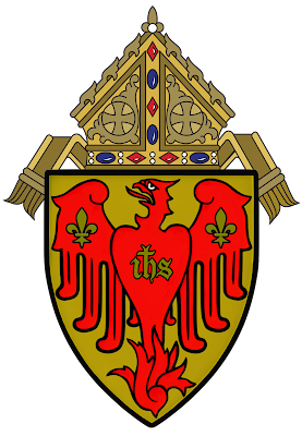
Recent Posts

Showing posts with label Ecclesiastical Heraldry. Show all posts

Friday, October 6, 2023

"Heralditis" and the American Architect


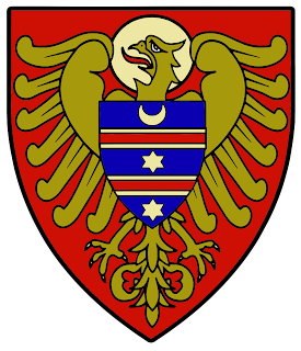
The arms of Pierre de Chaignon la Rose as illustrated on his 1895 bookplate. Digital rendering by vErmines Love Supreme, August 2023.

Herald/i/tisnoun: (i) a condition infecting an individual to employ heraldic decoration for artistic purposes without regards to the rules or customs of heraldry; (ii) when a designer of a coat arms ignores the primary canon, arma sunt distinguendi causa, that armorial bearings should simply and clearly identify its owner and nothing more.

Example: "The architect was deeply afflicted with heralditis and sketched out a new quartered coat of arms for the school's chapel, which does not clearly identify the school at all."  

__________________

Acknowledgement 

Special thanks and appreciation to Matthew Alderman, heraldic artist to the New England Historic Genealogical Society's Committee on Heraldry, for his gracious assistance in tracking down la Rose's article published in Liturgical Arts

__________________

As the nation's leading herald in the early to mid-20th century, Pierre de Chaignon la Rose (1872-1941) encountered an American mindset afflicted with what he would eventually define as "heralditis."  In nearly every new corporate coat of arms he would design for an organization, la Rose would spend more time sending correspondence to those leaders explaining the rules and customs of heraldry than any rationale for its design--a noble, yet exhausting endeavor.  

There is no question, therefore, that la Rose's prescription for battling heralditis was pure and simple:  education.  La Rose was not the only herald on a mission to fight this good fight.  Ralph Adams Cram (1863-1942) aided in the prescription of education with his article, "The Heraldry of the American Church" (1901 June 29).  The Rev. Dr. C. Ellis Stevens (d. 1906) made an additional contribution to the cause with his 1902 article, "Anglican Episcopal Seals," (April 5, 431-435).  

La Rose's first attempt can be found in a series of articles he published in Cram's Christian Art in 1907 (La Rose, 1907 May; La Rose, 1907, November).  These two articles focus heavily on Anglican heraldry and specifically seals and arms found within the Episcopal Church.  The singular focus is rather interesting, likely reflecting la Rose's growing impatience with appointed committees of amateurs.

In 1914, the herald would publish one last attempt to assuage fears of heralditis creeping into the Anglican and Episcopal Church with his article on ecclesiastical heraldry in The Living Church (La Rose, 1914 April 11, 835-836).  Following publication in 1914, la Rose seemingly surrenders to the Episcopal Church; at present, there is no data concerning the herald's attempt to provide further education on heraldry within the Episcopal Church.  

The fight against heralditis would be a life-long pursuit for the herald, engendering in many ways his life's purpose.  

An example of heralditis as found in the armorial bearings for The University Choir at The University of the South in Sewanee, Tennessee.  These arms in no way identify the owner as being a choir, much less one from Sewanee, and were likely appropriated from an early architectural sketch of arms for All Saints' Chapel.  Image source:  The University Choir Facebook page.

A recent discovery from the Archives of the University of Notre Dame revealed another such document promoting education of heraldry to fight the dreaded disease of heralditis.  In an undated document written by la Rose, "Ecclesiastical Heraldry and Architects," we learn the herald's first use of heralditis (La Rose, n.d.).  With the kind assistance from Matthew Alderman, we now know the undated document from the Archives of the University of Notre Dame was the basis for la Rose's article by the same name published by Liturgical Arts in 1933.  

Armorial bearings devised by la Rose for the Diocese of Sacramento in 1923 and the Diocese of Oklahoma (now Archdiocese of Oklahoma City) in 1922.  Image is courtesy of Matthew Alderman and appears in La Rose (1933), 191.  Click image to enlarge.

La Rose (1933) adds black and white emblazonments in the article of his designs for arms of the following archdioceses/dioceses:  Cleveland, Monterey and Fresno, Manchester, Santa Fe, Portland (ME), Rochester, Milwaukee, Seattle, Helena, San Francisco, Toledo, and Leavenworth.  The herald selected the Dioceses of Sacramento and Oklahoma for full colored emblazonments.

La Rose begins his manifesto:

"When the editor invited me to contribute an article on heraldry, I was a bit nonplussed, for heraldry is not a liturgical art, in that no phase whatever of the Church's liturgy involves its use.  The Church existed for twelve centuries or more without the slightest need of it, and if tomorrow heraldry were to be wiped off the face of the globe--which I sometimes wish would happen--the Church would be no poorer liturgically. 

"To phrase such a wish requires explanation.  My reason for it is that, in America, the essential nature of heraldry and its underlying purpose are pretty generally misunderstood, and, in consequence, it is constantly misused, especially by architects, and, for our specific purpose in this article, in ecclesiastical fabrics" (La Rose, 1933, 187).   

The article from 1933 gives us a glimpse into the herald's weary state of mind, having been worn down over the years by committees and armchair enthusiasts fighting back to advance heralditis in America.  

The high altar at St. Vincent Ferrer Parish in New York City.
Image is from the Parish's Facebook page.  Click image to enlarge. 

Ever the teacher and educator, la Rose provides an example of heralditis for the readers of Liturgical Arts.

"Better to explain what I am driving at, let me cite one or two specific instances.  In the church of Saint Vincent Ferrer, in New York, there is a frieze or band of decorative carving running round the clerestory which consists of an imposing array of coats-of-arms--an improbable decoration in a medieval church of its style.  

"On my first visit there I studied these arms with interest, and I daresay I should have felt flattered, because a large number were coats which I had myself designed for their owners.  But I could only groan, lamenting the, to me, obvious fact that my good friend, the architect, or some draughtsman in his office, had been temporarily afflicted with the worst case of 'heralditis' I have yet come across.  For I could discover few if any of the shields to have logical reason for appearing there.  

"To be specific, they were the arms of a number of Ordinaries, taken presumably from the Catholic Directory.  Now, of the prelates represented, only one could possibly have had any kind of juridical relation to this particular church; none, so far as I remember them was a member of the Order of Preachers.  I doubt if a single one had been a Benefactor, in the sense of having been financially concerned with the building of the fabric or its endowment; and finally, not one of them had yet been buried there.  

"Why, then, string up the personal arms of a group of people, however distinguished, who had no relation to this building, to the clergy in charge of it, or to the congregation that worships there?  This is sheer non-sensical heralditis, of a kind which no medieval architect would have ever been guilty" (La Rose, 1933, 190). 

Indeed, why?  The example from la Rose helps define this common illness which continues to plaque the American mindset to this very day.  I should say that, although the herald made sweeping strides in his battle, the war on heralditis continues.  Education for prevention is the best prescription, being mindful that this task can chip away at even the most battle-hardened knight.  

Works Cited

Cram, R.A. (1901 June 29).  The heraldry of the American church.  The Churchman, 83(26), pp. 813-818.

La Rose, Pierre de C. (n.d.). Ecclesiastical heraldry and architects.  Unpublished document.

La Rose, Pierre de C. (1907 May).  Ecclesiastical heraldry in America.  In R.A. Cram (Ed.), Christian Art, 1(1), pp. 64-70.

La Rose, Pierre de C. (1907 November).  Ecclesiastical heraldry in America II.  Diocesan arms.  In R.A. Cram (Ed.), Christian Art, 2(2), pp. 59-71.

La Rose, Pierre de C. (1914 April 11).  Ecclesiastical heraldry.  The Living Church, 50(24), pp. 835-836.

La Rose, Pierre de C. (1933).  Ecclesiastical heraldry and architects.  In H.L. Binsse (Ed.), Liturgical Arts, 2(4), pp. 187-194.

Stevens, C.E. (1902 April 5).  Anglican Episcopal seals.  The Churchman, 85(14), pp. 431-435.

Tuesday, October 3, 2023

Revisions & Updates

The arms of The Episcopal Church designed by la Rose between 1939-1940.
Rendered by Chad Krouse, 2024.

Over the past several days, I've gone back and revised several old articles.  I wanted to overhaul several important posts to fit my style standards, etc.  One such article, "Variations on a theme: Pierre de Chaignon la Rose and the cross in national colors," desperately needed to be updated.  Furthermore, I was able to add two more corporate coats within this same theme.  Please click here to read a thematic analysis of 13 corporate coats designed by la Rose in the cross in national colors.  

For a non-la Rosian article, I've revised the "Heraldry of the University of the South," and included new emblazonments rendered by Lucas A. Hofmann.  Please click here to learn more about the heraldry of The University of the South.

I'm currently working on another unidentifiable scholastic coat and fielding numerous emails from archives all over the place--an exciting time as I prepare to close a chapter on data collection.  I can hear my dissertation chair in my head saying, "after 10 years, you have enough data (250 or so corporate arms) so start your analysis and write!"  Yes, I hear this message loud and clear.  To be honest, it is exhausting at this point to keep searching for new discoveries, as the gap seems to widen more and more in locating sources for attribution and dating.  

Furthermore, I have since accepted that I could either spend the rest of my life hunting down lost arms designed by la Rose, or simply push forward with the data in hand.  I've longed believed that no single researcher holds an absolute knowledge on any given subject.  The goal of research, in the end, is to publish and plant a flag in the ground pointing the way for others to follow.  It is my hope that others will continue the quest I started back in 2014.  Onwards!  


Sunday, September 17, 2023

In My Backyard: The Arms of the Diocese of Richmond

Diocese of Richmond flag banner coat of arms
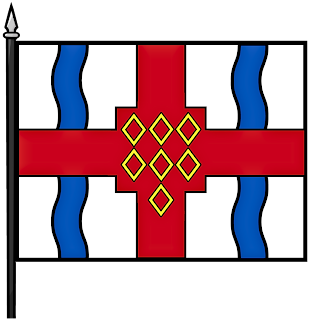
The armorial flag of the Diocese of Richmond.
Rendered by Chad Krouse, 2024.
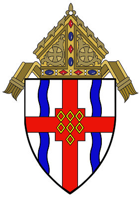
I live less than a mile away from the Cathedral of the Sacred Heart in Richmond, Virginia.  This cathedral houses the cathedra, or chair, for the Bishop of the Diocese of Richmond.  Prominently emblazoned on a bronze plaque near the cathedral's west doors is the coat of arms of the diocese, expertly designed in 1913 by Pierre de Chaignon la Rose (1872-1941).  In a weird and unexplainable way, it feels comforting to know la Rose's heraldic work lives on so close to home.  

La Rose had a brilliant marketing scheme to showcase his heraldic work within the Roman Catholic Church.  Through articles he penned in The Ecclesiastical Review, a prominent national publication focusing on scholarly issues in the Church, la Rose would supply engraved images of arms he devised for both prelates and dioceses.  From my review of his articles in The Ecclesiastical Review, la Rose used this channel to both educate and market his methods for heraldic designs--and readers took notice.  

Caricature of la Rose appearing
 in the Boston Sunday Post
(1903 Feb. 15).
Moreover, La Rose saw his landmark commission in 1910 to design arms for the Archbishop of Baltimore,  James Cardinal Gibbons (1834-1921), followed by Archbishop and future Cardinal, William Henry O'Connell (1859-1944) of Boston, as effectively creating a new baseline for establishing unerring heraldry within the US Roman Catholic Church (La Rose, 1911).  

If heraldry in the US during the early 20th century could be a film, perhaps no other genre quite like the old gun-fighting wild western flicks--where the spirit of rugged individualism pervasively dictates one's survival--would seemingly feel an appropriate choice.  

La Rose would be our protagonist, complete with cigarette and a sheriff's badge, fighting it out on the dusty streets of Tombstone to wipe clean the scourge caused by outlawed heraldic "bucket shops."

In La Rose (1920), he offers this view regarding his purpose:  
"Of the fourteen archdioceses in the United States, we now have eight, a majority, equipped with diocesan heraldry, following the ancient precedent reestablished among us ten years ago by their Eminences Cardinal Gibbons and Cardinal O'Connell.  It is to be hoped that eventually the remaining six will follow suit" (41).
La Rose's crusade to convert as many dioceses as possible to employ flawless heraldry--both within the Episcopal Church and the Roman Catholic Church--engendered his life's purpose as a herald.  

The impaled arms of The Most Rev. Denis J. O'Connell,
designed by la Rose in 1913 and appearing in Brassard (1956), page 53.

In 1912, The Most Reverend Denis J. O'Connell (1849-1927) was named Bishop of the Diocese of Richmond and eventually la Rose was enlisted to design arms for both the bishop and the diocese.  O'Connell's impalement of arms containing his personal coat along with the arms of the Diocese of Richmond appeared in la Rose's article in The Ecclesiastical Review (La Rose, 1913).  La Rose designed both arms at the same time, ensuring the continuation of his baseline precedent for sound heraldry. 

For O'Connell's personal coat, La Rose (1913) provides the following blazon and rationale:
"Quarterly 1 and 4, per fess argent and vert between three trefoils counterchanged of the field a stag trippant proper... 
"The Ordinary's impalement [arms of Bishop O'Connell] is the first example among our American bishops of a quartered personal coat meaning precisely what quartering should mean--an armigerous paternal and maternal inheritance.  The Bishop's motto is that of the Wray family" (94).

La Rose pointedly notes the precise method for quartering arms--a heraldic method of combining two coats into a noble arrangement which continues to feverishly affect many American novices of heraldry.   

For the Diocese of Richmond, la Rose created the following blazon: Argent, an orle gules, over all on a bend azure three stars of the field.

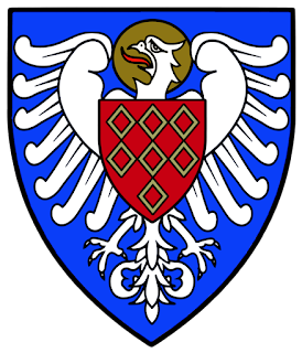
For comparison, the arms of
the Borough of
Richmond, England. 
Image is from
Heraldry-wiki.com
When I started my quest to uncover la Rose's heraldry in 2014, one of the first research requests went to the archives of the Diocese of Richmond, these arms were in my backyard and it seemed fitting to begin here.  Following a series of email exchanges, I was asked to provide a brief article for the diocesan archives, describing the origins of the diocese's arms as well as some background information on la Rose.  Little did I know at the time, the Diocese of Richmond would later publish my article in 2019 in concert with the diocese's bicentennial logo competition.  

One interesting data point to consider, and one that I missed earlier in 2014 regarding Richmond's arms.  When devising new arms for dioceses, la Rose frequently incorporated a reference by way of a charge or colors to the dedication of the see's cathedral.  

In checking the history of the Cathedral of the Sacred Heart in Richmond, the building's construction began in 1903 and was completed by 1906--well before la Rose's design for the arms of the diocese in 1913 (Cathedral of the Sacred Heart, 2023 September 16).  La Rose did not use this method of referencing the see's cathedral in the arms of Richmond, and I cannot explain why--a minor detail I missed in my earlier research.  

It's rather amusing to read my work from nearly 10 years ago--I was firmly in my post-seminary writing mode, or a "highly romanticized" style which my doctorate would later calm.  Scholarly writing in the social sciences is quite straightforward given the clinical conventions of the Publication Manual of the American Psychological Association.  

When I begin drafting a book manuscript on la Rose in the coming months, I will be challenged to convert back to my beloved Chicago-style.  I mean, who doesn't enjoy a good footnote?  Below is my article, "Arms of the Diocese of Richmond: Origins and Designs," to peruse.  Dear reader, please forgive me.       


Works Cited

Brassard, G. (1956).  Biographical and heraldic dictionary of the Catholic bishops in America (vol. 2).  Stobbs Press, Inc.

Boston Sunday Post (1903 February 15).  Harvard professors object the side-spitting caricatures of themselves by talented students.  Boston Sunday Post, 26.

Cathedral of the Sacred Heart (2023 September 16).  Our cathedral: Cathedral history.  Cathedral of the Sacred Heart. https://www.richmondcathedral.org/our-cathedral/

La Rose, Pierre de C. (1911).  The arms of his Eminence Cardinal Gibbons.  In H.J. Heuser (Ed.), The Ecclesiastical Review, vol. 5(45), pp. 2-11.

La Rose, Pierre de C. (1913).  Recent episcopal arms.  In H.J. Heuser (Ed.), The Ecclesiastical Review, vol. 49(July), pp. 90-96.

La Rose, Pierre de C. (1920).  Recent episcopal coat of arms.  In H.J. Heuser (Ed.), The Ecclesiastical Review, vol. 62(July), 41.

Friday, September 15, 2023

Two Corporate Coats Emerge From Black & White

A full color emblazonment of the arms of the Foreign Mission Sisters of Saint Dominic, designed jointly by Pierre de Chaignon la Rose and The Rev. John A. Nainfa, S.S. in 1923.  Image is courtesy of the Maryknoll Mission Archives, September 2023.

In a recent search online, I happened across a pleasant surprise.  The Maryknoll Mission Archives published a rather thorough review of two corporate coats designed by Pierre de Chaignon la Rose (1872-1941) and his Sulpician heraldic partner in crime, The Rev. John A. Nainfa, S.S. (1878-1938).  Furthermore, the Archives posted full color emblazonments from their collections--a veritable feast for the eyes.  Please click here to read the article by the Maryknoll Mission Archives.

Both of these coats of arms represent a key theme in la Rose's heraldic work.  The "cross in national colors" was an early theme I found in my analysis regarding several designs devised by la Rose.  Please click here to read my article on the theme of the "cross in national colors."  Previously, I had only seen emblazonments of these two coats in black and white, which truly does no justice to their designs.  Seeing these coats in full color, however, proves the "carry power" of these shields, a point la Rose often cited with his new designs, and this is what made me smile.  

A modern emblazonment of the seal and arms for the Catholic Foreign Mission Society of America, designed in 1917-1918 by The Rev. John A. Nainfa, S.S.  Image is courtesy of the Maryknoll Mission Archives, September 2023.

In La Rose (1918), we learn that la Rose credits the design for the Catholic Foreign Mission Society of America to his heraldic partner The Rev. John A. Nainfa, S.S.who was working at the Catholic University of America located in Washington, DC.  Oftentimes, la Rose would lean on Nainfa for historical background when devising new arms for Roman Catholic institutions. 

The arms of the Catholic Foreign
Mission Society
within a seal matrix composed
of a gothic quatrefoil. 
Image source: La Rose (1918), page 193.
La Rose (1918) writes:

"...the arms of the Catholic Foreign Mission Society of America, designed by The Reverend John A. Nainfa, S.S.  Its blazon:  Argent, a cross quarterly azure and gules.  

Here the same idea--the Cross in the national colors--is carried out with admirable directness and decorative simplicity" (193).  

Again, to see this coat in full color is simply stunning.  

In 1923, we would see yet another coat of arms designed along the theme of the "cross in national colors," jointly designed by la Rose and Nainfa.  The arms of the Foreign Mission Sisters of Saint Dominic was featured in a national publication, The Field Afar, as seen below.  

From The Field Afar, September 1923, page 254.  Image is courtesy of the
Maryknoll Mission Archives, September 2023.  Click image to enlarge.  

Based on my research of la Rose's heraldic work, I believe la Rose suggested the gyronny combined with Nainfa's Maryknoll cross for the design.  Furthermore, the painting of the Sisters' arms above in the introduction, was most likely rendered by la Rose--the lettering in the ribbons below the shield match other works by la Rose in my data.  Ecce ancilla domini, or "behold the handmaid of the Lord," is from the Vulgate version of the Gospel of Luke 1:38.  The Annunciation of the Lord is a rather fitting motto representing the work and mission of the Order. 

Finally, the shape of the shield for the Sisters' arms is reflective of one of the six shapes la Rose employed throughout his work--the differences in the two shapes when set side-by-side can be seen in The Field Afar (1923).

The joint attribution in The Field Afar (1923), coupled with Nainfa's credit in La Rose (1918), was most likely la Rose's statement to correct the injustice he endured at the hands of the University of Chicago in 1910.  Please click here to read the story of mistaken identity in the arms of the University of Chicago.  

Arms of the Foreign Mission
Sisters of Saint Dominic appearing
in The Field Afar (1923), page 254.
Why do I assert this belief?  Simply because everything la Rose did served a purpose.  As a student of English and eventually a professor thereof, every word la Rose used mattered.  If memory serves me well, la Rose's attribution of Nainfa in La Rose (1918), was the only instance la Rose illustrated arms created by another herald in the multitude of articles he published in The Ecclesiastical Review.  

The joint attribution in The Field Afar (1923) represents a significant outlier in my data of more than 250 corporate arms designed by la Rose--this case is the only instance of joint attribution.  I am not a conspiracy theorist; the data merely suggests there is much more behind this story of joint attribution. 

Nonetheless, the black and white emblazonment of these arms does not render justice to the splendor of color found upon the shield.  The arms of the Sisters' carry the gyronny of eight representing the order's ties to Saint Dominic as well as the Maryknoll cross in national colors.  The blazon for the arms of the Foreign Mission Sisters of Saint Dominic:  gyronny of eight argent and sable, a cross quarterly azure and gules

Heraldry is meant to be rendered in full color;  the identification and "carrying power" of any given coat of arms demands the splendor of colors, metals, and furs.  Thank you Maryknoll Mission Archives for sharing these vividly colored arms in your article.

Works Cited

Conning, S. (2023 September 13).  Coats of arms.  Maryknoll Mission Archives website.  https://maryknollmissionarchives.org/coats-of-arms/

La Rose, Pierre de C. (1918).  Some examples of Catholic corporate heraldry.  In H.J. Heuser (Ed.), The Ecclesiastical Review, vol. 58(February), pp. 189-198.

The Field Afar (1923).  Arms of the Catholic Foreign Mission Society of America and Foreign Mission Sisters of Saint Dominic.  The Field Afar, vol. 17(9), 254.

Thursday, September 14, 2023

The Glory and Unification of the Phoenix: A Case Study of Arms in Chicago

University of St. Mary of the Lake coat of arms flag shield crest
The seal and arms of the University of Saint Mary of the Lake in Mundelein, IL, designed by Pierre de Chaignon la Rose in 1930.  Rendered by Chad Krouse, 2024. 

For nearly 10 years, Chicago presented a major hurdle in my ongoing research focusing on the heraldic work of Pierre de Chaignon la Rose (1872-1941). Why? Due to gaps and limitations in the holdings of several important archives, I could not prove my long standing view that la Rose designed the arms for the Archdiocese of Chicago and the University of Saint Mary of the Lake--I had the supporting evidence of la Rose's work for Mundelein College. The rendering of the phoenix simply haunted me. While feelings can serve as a guiding impulse towards any given notion, having supporting evidence is, by far, superior.

I want to acknowledge and give special thanks to the archivists at the Women and Leadership Archives of Loyola University Chicago.  Through their preservation and kind assistance, we finally have data unlocking the mystery surrounding the "phoenix rising from the flames" in three corporate coats designed by la Rose for Roman Catholic institutions in Chicago.

Two Tasks In One Design

Through la Rose's heraldic designs for these three Roman Catholic institutions, we find clear evidence of his methodology for unification and differencing of arms.  In other words, the "phoenix rising from the flames," was the charge showing unification, while smaller charges placed on the either the breast or wings of the phoenix presented an artistic opportunity to show differencing at the same time.  This distinctly "la Rosian" method--placing charge upon charge--is but one version of how la Rose would accomplish these two critical tasks.  
Seal and arms of the University of St. Mary of the Lake.
Rendered by Chad Krouse, 2024.
Given the shear volume of designs he created, la Rose needed multiple methods for these two tasks in order to maintain consistency and thus allowing each new coat to be unique.  No respected herald would propose undifferenced arms from an established coat for new corporate arms, and la Rose worked diligently to cultivate his highly respected position as a herald in the US at a time when the field was void of such heralds.  To learn about la Rose's first method for both unification and differencing, please click here to read a case study on the arms of the Diocese of Quincy.

As I complete analyses on certain heraldic findings, especially in cases when the institution in question does not know or have any identifying information regarding their coat of arms, I make time to send all information I have in an effort to educate and complete their records.  This important educational step underscores my intention to help share the brilliance of la Rose's work--what good is served by hoarding vital historical information regarding these corporate arms?  Already with several such cases, I have thoroughly enjoyed helping institutions piece together these historical findings, and the responses have been both overwhelmingly positive and appreciated.  A major victory for la Rose!  

La Rose's First Academic Commission 

A close up view of la Rose's University of Chicago
design #1 
carved above the entrance portico of
Harper Memorial Library. Image is from
the University of Chicago website.
The story of la Rose's work in Chicago begins in 1910 with his sketches for new arms for the University of Chicago.  To read more about la Rose's work with the University of Chicago, please click here to see how the "phoenix rising from the flames" would take flight.   La Rose's first draft of the arms for the university would be used for heraldic carvings on Harper Memorial Library, and later adopted by the board but revised following a "restudy" (La Rose, 1910).  For the University of Chicago, the final version of arms after the "restudy" was rendered by Sir Henry Farnham Burke (1859-1930), then Somerset Herald of Arms in Ordinary with the College of Arms in London (Office of Counsel and Business Manager, 1912).

The main objection to la Rose's design used for carvings on Harper Memorial Library was raised by the College of Arms in London.  As a reference, la Rose blazoned University of Chicago design #1, "argent on a phoenix gules an open book of the first, edged and bound or" (La Rose, 1910, 2).  

The heralds in London believed the placement of the open book upon the breast of the mythical bird was illogical, that while the phoenix itself is saved from the fires below, any object such as a book on its chest would likely be consumed (University of Chicago, 1912).  At present, I am unable to locate any response from la Rose concerning the heralds' astute observation.  

We learn la Rose's opinion, however, regarding this question of logic in the next instance la Rose used the "phoenix rising from the flames."  

The Phoenix Rises in Atlanta
Episcopal Diocese of Atlanta coat of arms shield crest logo
Coat of arms, the Episcopal Diocese of Atlanta.
Rendered by Chad Krouse, 2024.
In 1920, la Rose designed arms for the Episcopal Diocese of Atlanta and charged the breast of the bird with a cross bottony to reference the dedication of the see's cathedral to Saint Philip (Diocese of Atlanta, 1921).  If la Rose agreed with the heralds in London concerning the possible consumption by fire for charges placed upon the bird, then he would not have placed the cross bottony for Saint Philip in Atlanta's arms. 
Episcopal Diocese of Atlanta coat of arms flag shield crest logo
Banner of arms, the Episcopal Diocese of Atlanta.
Rendered by Chad Krouse, 2024.
The blazon for the arms of the Episcopal Diocese of Atlanta: Argent, on a pheonix rising from the flames gules a cross bottony of the first, on a canton azure a ciborium of the first (Diocese of Atlanta, 1921).  Thus, we know how la Rose likely felt about this matter.        

For Chicago, however, the phoenix would rest peacefully until 1930.  

Chicago Revisited 

His Eminence George Cardinal Mundelein (1872-1939) would be the first Archbishop of Chicago to be elevated to the College of Cardinals in 1924, and in my review of data, it certainly appears that Cardinal Mundelein's ministry was quite fruitful in the archdiocese, as His Eminence founded several institutions of higher learning as an example (Kahover, 2014).

Originally chartered in 1844 under the leadership of the first Bishop of Chicago, William Quarter (1806-1848), the University of Saint Mary of the Lake would serve as the seminary for the archdiocese, but ultimately shuttered her doors to priestly formation by 1866 (Kahover, 2014).  By the time Cardinal Mundelein took over the reigns of the Archdiocese of Chicago, there was a pressing need for more priests, and Cardinal Mundelein reopened the university in 1920 (Kahover, 2014, 9).

University of St Mary of the Lake coat of arms shield crest logo
Coat of arms, the University of St. Mary of the Lake.
Rendered by Chad Krouse, 2024.

Tracking down the origins of the university's arms, however, led to many dead ends.  The answer to unlocking the 10-year mystery surrounding the designer of the arms for both the university and the Archdiocese of Chicago was found buried in the Women and Leadership Archives of Loyola University Chicago.

In a letter dated July 19, 1930 from la Rose to the Reverend Sister President of Mundelein College, la Rose explains the design rational for the college's new arms, and references Cardinal Mundelein in the letter:
"Then to show that the College is in Chicago, I have used the phoenix rising from his flames.  I refer you to the classical legend.  This symbol not only typified the history of the city, but is itself the ecclesiastical symbol of the resurrection.  
"I have but a month or so ago submitted to His Eminence a design of arms for the Archdiocese of Chicago embodying this symbol.  He now has it under consideration, but as he has already authorized its use, to indicate the Archdiocese, on the arms I am designing for the seminary (St. Mary of the Lake) I should wish, for the sake of uniformity in arms of the archdiocesan foundations, to use it also on your shield--subject to His Eminence's approval" (Letter from la Rose to the Reverend Sister President of Mundelein College). 
Finally, we have answers regarding all three of these attractive arms bearing the phoenix rising from the flames.  It is important to note, however, that the Archives of the Archdiocese of Chicago does not have any information in their collections regarding la Rose or the designs for the archdiocese's arms.  Yet, based on this data, it is evident and clear that la Rose should be attributed as the designer.  

La Rose added "(St. Mary of the Lake)" as the reference in the letter for the seminary.  While others may (and certainly have) disagreed with me regarding la Rose's attribution as the designer for the arms of the University of Saint Mary of the Lake and the Archdiocese of Chicago, no other herald was employing the phoenix in the early 20th century, much less rendering the mythical bird in the simplest form possible.  Additionally, la Rose enjoyed a prominent national reputation within the US Roman Catholic Church by this time, and likely most bishops were well aware of his work designing diocesan arms.       

Taken together, these three coats of arms illustrate la Rose's clever methods for showing unification and differencing at the same time.  If we follow the order mentioned in la Rose's letter, then, the arms were designed chronologically with the University of Saint Mary of the Lake as the first, the Archdiocese of Chicago next, and finally Mundelein College rounding out the trio of arms.

The Seminary Reborn

The University of Saint Mary of the Lake is located on the shore besides Saint Mary's Lake in Mundelein, Illinois and the barry wavy in base makes this reference clear for identification.  The torteau, or red roundel, is a play upon the Cardinal's red zuchetto worn by the second founder, Cardinal Mundelein.  The demi-phoenix upon the chief carries the two fleurs-de-lis that would eventually appear in the arms of the archdiocese--a reference to the early French settlers in the Chicago area.  In this instance, la Rose uses the chief to show the university's unification, or that the institution is an archdiocesan foundation.

University of St. Mary of the Lake coat of arms flag shield crest
Banner of arms of the University of St. Mary of the Lake.
Rendering by Chad Krouse, 2024.

The blazon for the arms of The University of Saint Mary of the Lake: Azure, issuing from a lake barry wavy in base, three Madonna lilies conjoined argent charged with a torteau, on a chief of the second, a demi phoenix displayed gules between two fleurs-de-lis on the wings of the second.  

The Arms of the Corporate Sole

For the Archdiocese of Chicago's arms, la Rose employed his method of referencing the patronal saint or the dedication of the see's cathedral, by way of a charge or tincture (color).  The see's cathedral is where the cathedra or chair of the prelate in question resides--the seat of authority for the episcopacy.  Presently, I have in my data 27 coats of arms for both Episcopal and Roman Catholic dioceses/archdioceses where la Rose employs this design technique.  The Cathedral of the Holy Name in Chicago houses the cathedra of the Archdiocese, and thus the monogram of the Holy Name is placed upon the breast of the phoenix.    

Archdiocese of Chicago coat of arms shield crest logo
Coat of arms, the Archdiocese of Chicago.
Rendered by Chad Krouse, 2024.
The blazon for the arms of the Archdiocese of Chicago:  Or, on the breast of a phoenix rising from the flames gules the monogram of the Holy Name between two fleurs-de-lis on the wings all of the field. 

It must be disclosed that without la Rose's letter from July 19, 1930 to the President of Mundelein College, it may likely be impossible to prove la Rose's hand in designing the arms for the Archdiocese of Chicago.  Likewise, there is no existing data that can be found to disprove la Rose's design for the archdiocese.  

Archdiocese of Chicago flag coat of arms shield crest logo
Banner of arms, the Archdiocese of Chicago.
Rendered by Chad Krouse, 2024.
There is one additional data point to consider, however.  In La Rose (1920), we get a glimpse into la Rose's plan for devising arms for all the archdioceses in the US.  Having just illustrated and explained the newly devised arms for the Archdiocese of Saint Paul in the article, la Rose adds:
"Of the fourteen archdioceses in the United States, we now have eight, a majority, equipped with diocesan heraldry, following the ancient precedent reestablished among us ten years ago by their Eminences Cardinal Gibbons and Cardinal O'Connell.  It is to be hoped that eventually the remaining six will follow suit" (La Rose, 1920, 41).
La Rose had a plan from the beginning to convert all the archdioceses over to sound heraldry for their arms.  While la Rose rendered the arms for the archdiocese in 1930, these arms would not be officially used until the late 1930s when Archbishop Samuel Stritch (1887-1958) succeeded Mundelein.  

My view is that Cardinal Stritch likely used la Rose's design for Chicago because Stritch previously led the Diocese of Toledo and the Archdiocese of Milwaukee prior to his translation to Chicago--both sees bore coats of arms designed by la Rose.  As a reference, the Diocese of Toledo's arms were designed in 1912 and the Archdiocese of Milwaukee's arms in 1933.  

Mundelein College and the University of Chicago 

Mundelein College coat of arms crest shield logo
Coat of arms, Mundelein College.
Rendered by Chad Krouse, 2024.
Mundelein College, established by the Sisters of Charity of the Blessed Virgin Mary, officially opened as a Catholic women's college on November 1, 1929--a mere two days following the disastrous crash of the US stock market (DeCock, 2001).  By 1991, Mundelein College would merge with Loyola University Chicago (Harrington & Moylan, 2001).
Mundelein College flag coat of arms crest shield logo
Banner of arms, Mundelein College.
Rendered by Chad Krouse, 2024.
Interestingly enough, Ralph Adams Cram (1863-1942) was hired to design the college in 1917, but work stopped as a result of World War I (Tarvardian, 1990, 56).  It is probable, therefore, that la Rose's involvement by 1930 was the result of Cram.  

The flag arranged based on the arms of Mundelein College, designed by Pierre de Chaignon la Rose in 1930.  Image is courtesy of the Women and Leadership Archives of Loyola University Chicago, September 2023.
For la Rose's third coat relating to the archdiocese, he recycled the first design he used for the University of Chicago in 1910.  This time, however, la Rose inscribed the open book for the proposal and further differenced the arms with the two roundels on the wings of the phoenix.

La Rose provides details regarding the book and charges placed on the wings of the phoenix to the Reverend Sister:
"On the 'Mundelein' book, I have provisionally placed Our Lord's own definition of himself, which also sums up the aims of all Catholic education.  But on this point you will naturally have your own choice to make... 
"These two symbols--the star and your badge--are very disparate in design, and it becomes necessary to make a tolerable heraldic composition, to bring them into some sort of uniformity at least of general outline.  I have therefore placed the silver star on a blue silver edged 'roundel' (silver and blue being Our Lady's heraldic colors) and done the same with your B.V.M., cross, and Passion nails... 
"The shield as it now stands reveals its ownership declaring it as clearly as the conventions of heraldry and the data at our disposal permit" (Letter from la Rose to the Reverend Sister President of Mundelein College, 1930 July 19).   
The inscription of Mundelein College's open book, via veritas vita, comes from the Vulgate version of the Gospel of John 14:6, "I am the way, the truth, and the life."  Indeed, a fitting motto for any Roman Catholic educational institution.

The arms of Mundelein College which was located in Chicago, IL and designed by Pierre de Chaignon la Rose in 1930. Image is courtesy of the Women and Leadership Archives of Loyola University Chicago, September 2023.
The arms for Mundelein College is blazoned:  Argent, on a phoenix rising from the flames gules, an open book edged or thereon inscribed VIA VERITAS VITA, on dexter wing a roundel azure edged of the field charged with a star of the first and on sinister wing a roundel of the fourth edged of the field charged with the symbol of the Sisters of Charity of the Blessed Virgin Mary of the first.  

The banner of arms of Mundelein College, designed by Pierre de Chaignon la Rose in 1930.  Image is courtesy of the Women and Leadership Archives of Loyola University Chicago, September 2023.
The year 1930 would prove quite a busy year for la Rose, a year of redemption for him in the Windy City.  If the "phoenix rising from the flames" serves as the Christian symbol for resurrection, it might also be an apt symbol for la Rose himself in relation to his work in Chicago.  That two of the three coats of arms discussed here are still in use 93-years later, attests to both the carrying power of the arms and the brilliance of the designer behind them.   

In recent years, both the University of Saint Mary of the Lake and the Archdiocese of Chicago decidedly removed the two fleurs-de-lis that were incorporated on the wings of the phoenix in both coats of arms.  Why?  I cannot find a logical explanation for the removal, and logic combined with the phoenix can get any herald into trouble. 

Works Cited  

DeCock, M. (2001).  Creating a college: The foundation of Mundelein, 1929-1931.  In A.M. Harrington & P. Moylan (Eds.), Mundelein voices: The women's college experience 1930-1991 (pp 3-29). Loyola Press.

Diocese of Atlanta (1921).  Journal of the 14th annual meeting of the council.  The Episcopal Diocese of Atlanta, 4.

Harrington, A.M. & Moylan, P. (Eds.). Mundelein voices: The women's college experience 1930-1991. Loyola Press.

Kahover, G. (2014).  Mundelein Seminary.  Arcadia Publishing.

La Rose, Pierre de C. (1930 July 19).  Letter from Pierre de Chaignon la Rose to the Reverend Sister President of Mundelein College.  Unpublished letter. 

La Rose, Pierre de C. (1920).  Recent episcopal coat of arms.  In H.J. Heuser (Ed.), The Ecclesiastical Review, vol. 62(July), 41.

La Rose, Pierre de. C. (1910 July 29).  Arms for the University of Chicago.  Unpublished document.  

Office of Counsel and Business Manager (1912 February 8).  Letter from the Office of Counsel and Business Manager of the University of Chicago to Horace S. Fiske.  Unpublished letter.

Tarvardian, P.M.A. (1990).  An uncompromising commitment to mission:  Mundelein College and the advancement of women's higher education 1930-1950 (2732) [Doctoral dissertation, Loyola University of Chicago].  Loyola eCommons.    

University of Chicago (1912).  The phoenix and book.  The University of Chicago Magazine, vol 4(7), 243-248.

Wednesday, August 30, 2023

Unification and Differencing: A Case Study in Quincy

Diocese of Quincy Episcopal coat of arms crest shield
The arms of the Diocese of Quincy.
Rendered by Chad Krouse, 2024.

Over the past 10 years, I've diligently combed through archives across the US and Canada on my quest to uncover the heraldic work of Pierre de Chaignon la Rose (1872-1941).  I have met so many archivists and volunteers who are passionate about the organizations whose histories they maintain.  Sometimes I am lucky and find answers, other times not so.  Today, however, was one of those good days. 

During the 28th annual convention of the Episcopal Diocese of Quincy, which met on May 16-17, 1905 in the Cathedral of St. John, the assembly voted to officially adopt a coat of arms designed by la Rose (Diocese of Quincy, 1906, pages 34-35).  Based on my data, now hovering around 250 institutional coats designed by la Rose, the arms for the Diocese of Quincy was the first coat la Rose designed for an Episcopal diocese.  

The seal of the Diocese of Quincy designed by la Rose and found upon the bishop's cathedra inside St. John's Parish and Cathedral in Quincy, IL.  Photo courtesy of The Rev. Patrick Smith, Rector.  Note the diocese's motto, Jehovah Jireh, placed in the base of the vesica piscis. 

There is something else, however, that makes this coat extra special--keep reading.  

The blazon for the arms of the Diocese of Quincy: Argent, between two pallets wavy azure debruised in fesse, a cross quadrate gules, thereon seven mascles conjoined three, three, and one or.  

An article appearing in The Living Church (1906), offers this description for the diocese's arms:

"The story told upon the shield is an interesting one and descriptive of the location, the history, the work, and the aspirations of the diocese. One versed in heraldry might read the shield as follows: The land between the rivers, of military associations where the Anglican Communion has spread the gospel net, which land is Quincy and whose church sends influences beyond the rivers. This is a free translation, very free, but better understood to-day than the language of ancient heraldry. 

"The diocese includes a little more of the State of Illinois than was in what was known as the 'Military Tract,' a tract reserved after the war of 1812 to reward the soldiers. This fact, and the other one that within the diocese the Federal Government has its greatest arsenal, will account for the 'Military Associations.' 

"An interesting fact is that the lozenge like the devices in the centre of the shield arranged as these are, 3, 3, and 1 , in heraldry mean both Quincy and the gospel net. The motto 'Jehovah Jireh,' chosen as all will remember by Bishop Chase, while it may not properly be included in the design is correctly placed in the rim" (page 1007).  

Furthermore, DeKay (1993) notes that the arms of the diocese prominently features those from the "de Quincy family, Earls of Winchester, were [blazoned] 'gules, seven mascles conjoined, 3, 3, 1 or'" (page 36).  All of this background information is great, but there's more.

Diocese of Quincy Episcopal flag banner coat of arms crest shield
Banner of arms for the Diocese of Quincy.
Rendered by Chad Krouse, 2024.

In Wright (1908), we learn that not only did la Rose design arms for the diocese, but also arms for its cathedral of St. John (page 244).  This is the special coat that I've been pinning to see.    

The only way I could find these arms was to contact The Rev. Patrick Smith, Rector of St. John's Parish and Cathedral, who so kindly sent me these photographs today.  The parish and building are now affiliated with the Anglican Church.  Moreover, Wright (1908) notes that the reredos was designed by none other than the Boston-based firm of Ralph Adams Cram (1863-1942).  Wherever there is Cram, and heraldry is involved, la Rose is surely not far behind.

The arms of St. John's Cathedral carved onto the reredos inside St. John's Parish and Cathedral in Quincy, IL.  Photo courtesy of The Rev. Patrick Smith, Rector. 

The arms of St. John's Parish and Cathedral are blazoned: Azure, on an eagle displayed Argent aureoled Or, an escutcheon Gules charged with seven mascles conjoined three, three, and one Or.

St. John's Cathedral Quincy IL coat of arms shield crest
Arms of St. John's Cathedral.
Rendered by Chad Krouse, 2024.
Now, we have the very first coat that la Rose designed for a cathedral or parish in the US.  Through the arms of St. John's Cathedral, we encounter for the very first time la Rose's method for showing unification and differencing.  The escutcheon on the displayed eagle is a clear reference to the cathedral's ownership by the Diocese of Quincy.  In this one coat of arms, la Rose not only differences the established de Quincy coat, but does so in a rather genius way which shows unification at the same time. 

The altar and reredos in St. John's Cathedral were dedicated on July 7, 1907 (Wright, 1908, page 244).  Thus, it is likely--given the time lag between mailing designs, actual construction, to final dedication--la Rose designed these arms between 1905-1906. 

La Rose would use the displayed and aureoled eagle for St. John in several future designs, as well as charge heraldic creatures with an escutcheon showing unification.


St. Francis de Sales Seminary coat of arms crest shield logo
Arms of St. Francis de Sales Seminary (St. Francis, WI) designed by la Rose.
Rendered by Chad Krouse, 2024.

St. Edward's Seminary coat of arms shield crest kenmore
Arms of St. Edward's Seminary (Kenmore, WA) designed by la Rose in 1931.  Rendered by Chad Krouse, 2024.

If you're interested to read more about the arms of St. Edward's Seminary, click here to see one of my first posts regarding la Rose.  La Rose continues to keep me on my toes with how he uses charges, tinctures, and metals to either show unification or differencing in his work.  What is truly fascinating, at least to me, is that he worked out a logical solution to this problem very early in his heraldic career.  La Rose would continue to refine his methodology over the years, and I have many examples in my data.  Today was a good day.

Works Cited

DeKay, Eckford. (1993).  Heraldry in the Episcopal Church.  Acorn Press.

Diocese of Quincy (1906).  The 28th annual convention of the Diocese of Quincy.  Review Printing Company.    

The Living Church (1906).  Diocesan seal for Quincy.  The Living Church, vol 35(24), 1007.  

Wright, J. (1908).  Some notable altars in the Church of England and the American Episcopal Church.  MacMillan Company.  

Tuesday, August 15, 2023

Using Data to Identify La Rose's Work

The seal of the Missionary District of the Philippine Islands.  Most likely designed by la Rose between 1913-1917.  Image is from DeKay (1993).

As my research on Pierre de Chaignon la Rose (1872-1941) progresses, I recently discovered another coat of arms within the theme of the "cross in national colors," found in the arms for the Missionary District of the Philippine Islands of the Episcopal Church.  This new discovery seemed oddly perfect for a coat of arms designed by la Rose.  Rendering the cross in various forms combining red, white, or blue is a key theme found in several designs for arms la Rose created.  For a full analysis on the theme of the "cross in national colors," please click here to the article. 

Currently, I am unable to locate any evidence as to who designed the arms and seal.  Using the data that I have been collecting since 2014, I am able to analyze several elements to render a verdict.  

Firstly, the district was formed in 1901 and its status changed in 1937--dates that all nicely fit within la Rose's lifetime.  That piece of information, however, is too easy and the researcher must dig deeper.  Yes, the engraving above is a dead-ringer of la Rose's work with the lombardic font and artistic layout.  But, we need more information!  With limited access to the district's complete series of journals online, I have pieced together the following information to inform my attribution to la Rose. 

Architectural rendering of the seal in full color. 
Image is from Wikipedia.
According to the missionary district's annual reports that are accessible, reports for the years 1909, 1910, 1911, 1912, and 1913, there is no use of the seal or mention of its adoption.  However, a very interesting fact surfaced in my review of these documents.  In Missionary District of the Philippine Islands (1913), noted Boston architect Richard Clipston Sturgis (1860-1951) is mentioned twice for preparing architectural designs for St. Luke's in Manila (page 11 and 36).  

In 1910, Sturgis and la Rose worked together for the architectural rendering of arms for the Brookline Public Library in Massachusetts.  Click here to read my story about the arms of Brookline Public Library.  Thus, it is likely that if Sturgis needed a coat of arms for his architectural rendering for St. Luke's in 1913, he would have already known la Rose's capabilities.   

Date-wise, we can presume these arms were likely designed after 1913 and very probably around 1916 given la Rose's unique design for the Diocese of Maryland and it's cathedral as noted in Diocesan Convention of Maryland (1916).  Other than The Rev. John Abel Nainfa, S.S. (1878-1938) no one else in the US was designing arms using the quarterly-counterchanged cross method in the early 20th Century.  Nainfa designed the arms for the Catholic Foreign Mission Society of America in 1918 (La Rose, 1918) and la Rose blazoned these arms, "argent, a cross quarterly azure and gules" (pg. 193). 

The arms of the Catholic Foreign Mission Society of America (Maryknoll) devised by The Reverend John A. Nainfa, S.S. in 1918.  Nainfa was a dedicated partner early on with la Rose.
Image source from La Rose (1918).

Moreover, the cathedral for the missionary district--in place and referred to in the annual reports--is named the Cathedral of St. Mary and St. John in Manila.  The silver/white star in the coat is very likely a reference to either the Philippine's status vis a vis the US or the Blessed Virgin Mary, a unique method employed by la Rose.  

In my data of more than 200 corporate coats, I have 19 diocesan coats designed by la Rose where he uses a charge or certain tinctures as a reference to the patron saint of the see's cathedral.  Another example can be found in my analysis of the arms of the College of Notre Dame of Maryland.  Click here to read my analysis of the arms of the College of Notre Dame of Maryland.

La Rose's painting of the proposed arms for the Episcopal Diocese of New York.  The arms were never adopted.  Note the mitre.  Image is from Facebook and found in the Archives of the Cathedral of St. John the Divine, New York.

The mitre used in the vesica piscis is unique to la Rose.  In a letter from September 3, 1912 to The Rt. Rev. David Hummell Greer (1844-1919), Episcopal Bishop of New York, la Rose provides sketches for possible arms for the Diocese of New York to consider, see above.  The letter is housed in the archives of the Cathedral of St. John the Divine, New York.  As he closes the letter to the bishop, la Rose addresses the mitre he prefers to use as the external ornament placed above the shield:

"The mitre on my drawing [proposed coat of arms for the Episcopal Diocese of New York] is copied with very slight modification from those on the roll of peers dated 1515 in the Herald's College [College of Arms, London], a type which has crystallised and become now practically their official heraldic form for a mitre, and here we are concerned only with the mitre from the point of view of heraldry, not of archeology or liturgies" (Letter from Pierre de Chaignon la Rose to the Right Reverend David H. Greer).

When viewing la Rose's painting above for the Episcopal Diocese in New York (note that it's dated 1912), it is the exact same mitre used for the Diocese as Maryland as can be seen below.  I've added the Roman Catholic Diocese of Marquette (La Rose, 1923, 407-408), designed in 1923, to illustrate that la Rose did not discriminate between denominations.  La Rose would adorn countless diocesan coats with this exact mitre.  

Over the years, la Rose would rework and change up the mitre a bit and I have a few examples in my data of his evolving style.  Artistically, notice the curvature of the top of the shields shown in New York, Maryland, and Marquette.  Notice how the mitre fits rather snuggly on top of the escutcheon--these details are characteristic of la Rose and his obsession with decoration and elegance.  

Finally, la Rose was no stranger to the Philippines.  He devised arms for the Roman Catholic Dioceses of Tuguegarao in 1911 (La Rose, 1911, 8-9) and Zamboanga in 1917 (La Rose, 1917, 624-625).  

To review all known data for the arms of the Missionary District of the Philippine Islands:  we have the right dates for la Rose, we have the simplicity of the design, the design matches a key theme of la Rose's work, we have a named architect who la Rose worked with around the same time, we know of other arms designed in the Philippines around the time, and we have a match with the style of mitre used by la Rose.  Data does not lie.  Thus, given all of this information, I proudly give la Rose credit for the arms of Missionary District of the Philippine Islands.  

DeKay (1993) gives the blazon as, "quarterly gules and argent, a cross counterchanged, in dexter chief a mullet of the second" (pg. 87).

La Rose's painting of the arms for the Episcopal Diocese of Maryland and designed in 1916.

La Rose's painting of the arms for the Roman Catholic Diocese of Marquette in Marquette, Michigan.  Designed in 1923 (La Rose, 1923).

One prevailing criticism of DeKay's (1993) work is that it lacks citations.  At no point in his book will the reader find references to his data.  I remember receiving my copy back in 2006, and like most amateur students of heraldry, I simply loved thumbing through all the pictures.  It never once occurred to me back then to look for references. 

In DeKay (1993), there are several coats designed by la Rose in which DeKay does not mention the designer.  Those coats designed by la Rose and unattributed by DeKay (1993) are in my data and verified with sources.  Thus, here is what I find rather ironic.  In his early section which describes the heraldic artists who dominated the landscape within the Episcopal Church, DeKay writes:
"Among the seals he [la Rose] designed for dioceses of the Episcopal Church are those for the Dioceses of Springfield, Quincy, Lexington, Massachusetts, Western Massachusetts, Michigan, West Missouri, Nevada, New Hampshire, Oregon, Pittsburgh, Rhode Island, Spokane, and Milwaukee.  
Truly Mr. LaRose has left his mark.  These are listed in the same order as they appear in this book, so that you may browse through the diocesan section and spot them.  His style will become immediately apparent so that you will easily recognize a LaRose design when you see one..." (DeKay, 1993, 14).

Clearly, la Rose's style was not apparent to some, and I readily admit to passing over la Rose's arms for the Missionary District of the Philippine Islands many times in the past.  I was taught in my master's program at Sewanee to be kind and charitable towards all authors as a sign of respect for their work and contributions.  DeKay does give us a great overview of heraldry in the Episcopal Church as he makes an important contribution in advancing the literature on the subject.  Furthermore, we have the benefit in 2023 of a great many works digitized and easy to search.  Primary sources are readily available today thanks to the internet.  So, I will be kind.  Though, as I've said to my students in the past, cite everything.

Works Cited

DeKay, Eckford (1993).  Heraldry in the Episcopal Church.  Acorn Press. 

Diocesan Convention of Maryland (1916).  Journal of the one hundred and thirty-third annual convention of the Protestant Episcopal Church of the Diocese of Maryland.  Diocese of Maryland.

La Rose, Pierre de C. (1923).  Recent episcopal arms.  In H.J. Heuser (Ed.), The Ecclesiastical Review, vol. 69(October), 407-408.

La Rose, Pierre de C. (1918).  Some examples of corporate Catholic heraldry.  In H.J. Heuser (Ed.), The Ecclesiastical Review, vol. 55(February), 189-198.

La Rose, Pierre de C. (1917).  Some recent episcopal coats of arms.  In H.J. Heuser (Ed.), The Ecclesiastical Review, vol. 56(June), 624-625.

La Rose, Pierre de C. (1912 September 3).  Letter from Pierre de Chaignon la Rose to The Right Reverend David H. Greer.  Unpublished letter.

La Rose, Pierre de C. (1911).  The arms of his Eminence Cardinal Gibbons. In H.J. Heuser (Ed.), The Ecclesiastical Review, vol. 5(45), 8-9.

Missionary District of the Philippine Islands (1913).  Journal of the tenth annual convocation of the Missionary District of the Philippine Islands.  Missionary District of the Philippine Islands.